



Quick Answer
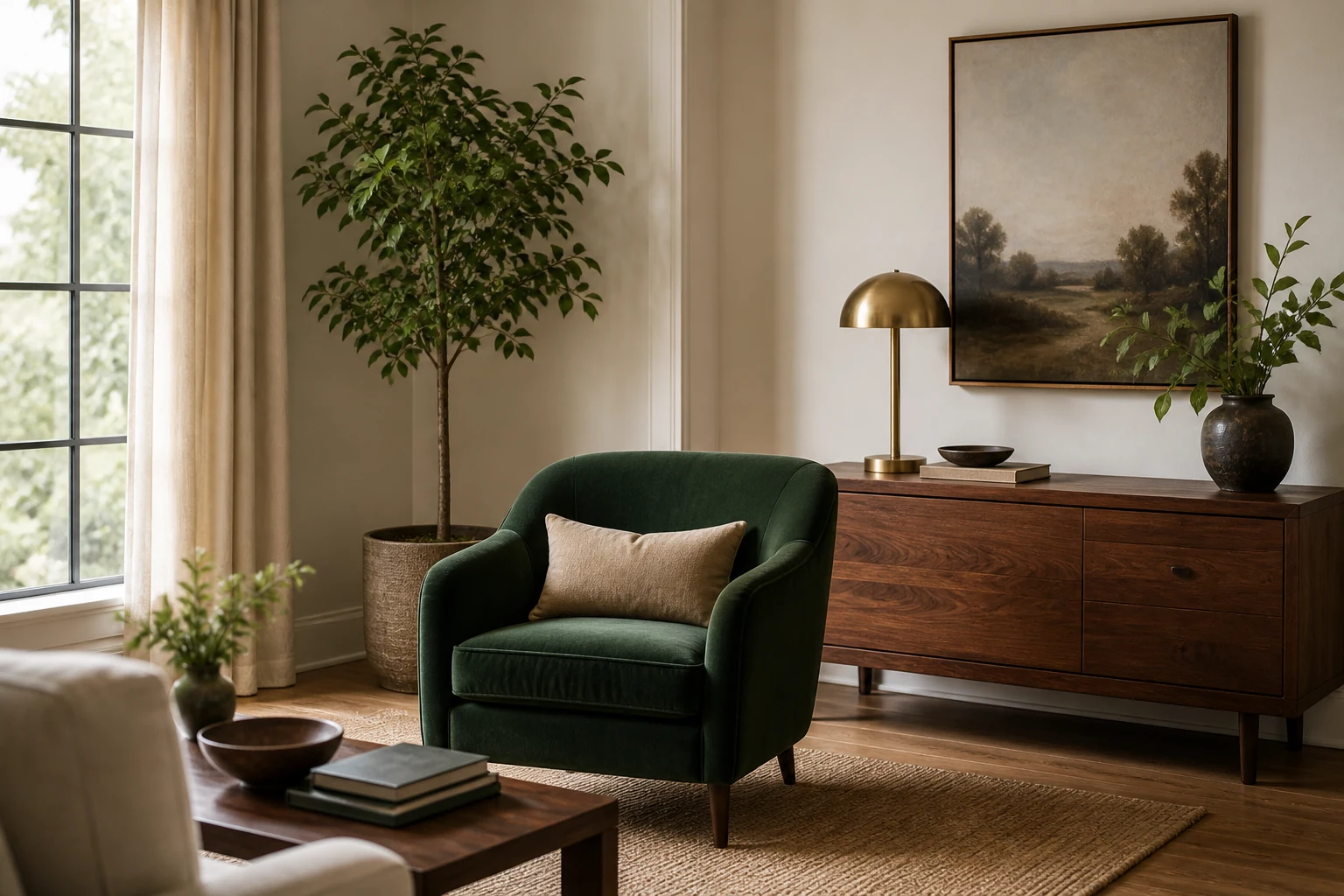
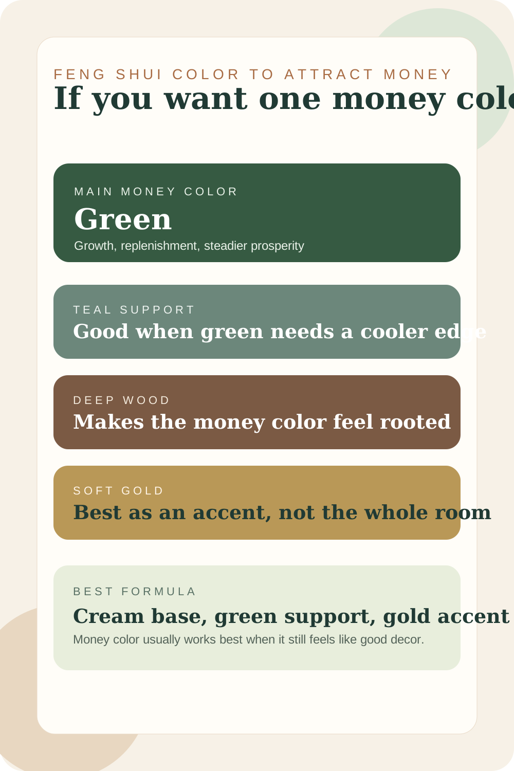
If you want one feng shui color that attracts money, start with green. It is the easiest money color to use well because it already suggests growth, replenishment, and steady life. The best support colors are cream, deep wood, muted teal, soft gold, and carefully placed richer accents.
Money color works best when it still looks like good decor. A room feels more prosperous when the color story looks calm, alive, and maintained rather than flashy.
That is why green tends to beat louder symbolic colors in real rooms. It feels livable. It can be used in paint, textiles, cabinetry, art, plants, or one stronger furniture piece without making the whole room harder to settle into.
This is the single-color answer page: green leads, and the other colors support it. For a broader room palette built around growth, nourishment, warm light, and several complementary colors, use colors that attract abundance. Keeping those tasks separate makes it easier to choose one clear next move.
Symbolic color is not a financial guarantee
Feng shui uses color as an environmental and symbolic design tool. A green chair or wall cannot guarantee income or change financial outcomes; it can only help create a space that feels more intentional, supported, and aligned with the goal you want to keep visible.
The Main Money Color That Makes the Most Sense
The most useful money-color directions
Think of green as the main direction, then use the others to help it feel warmer, richer, or more grounded.
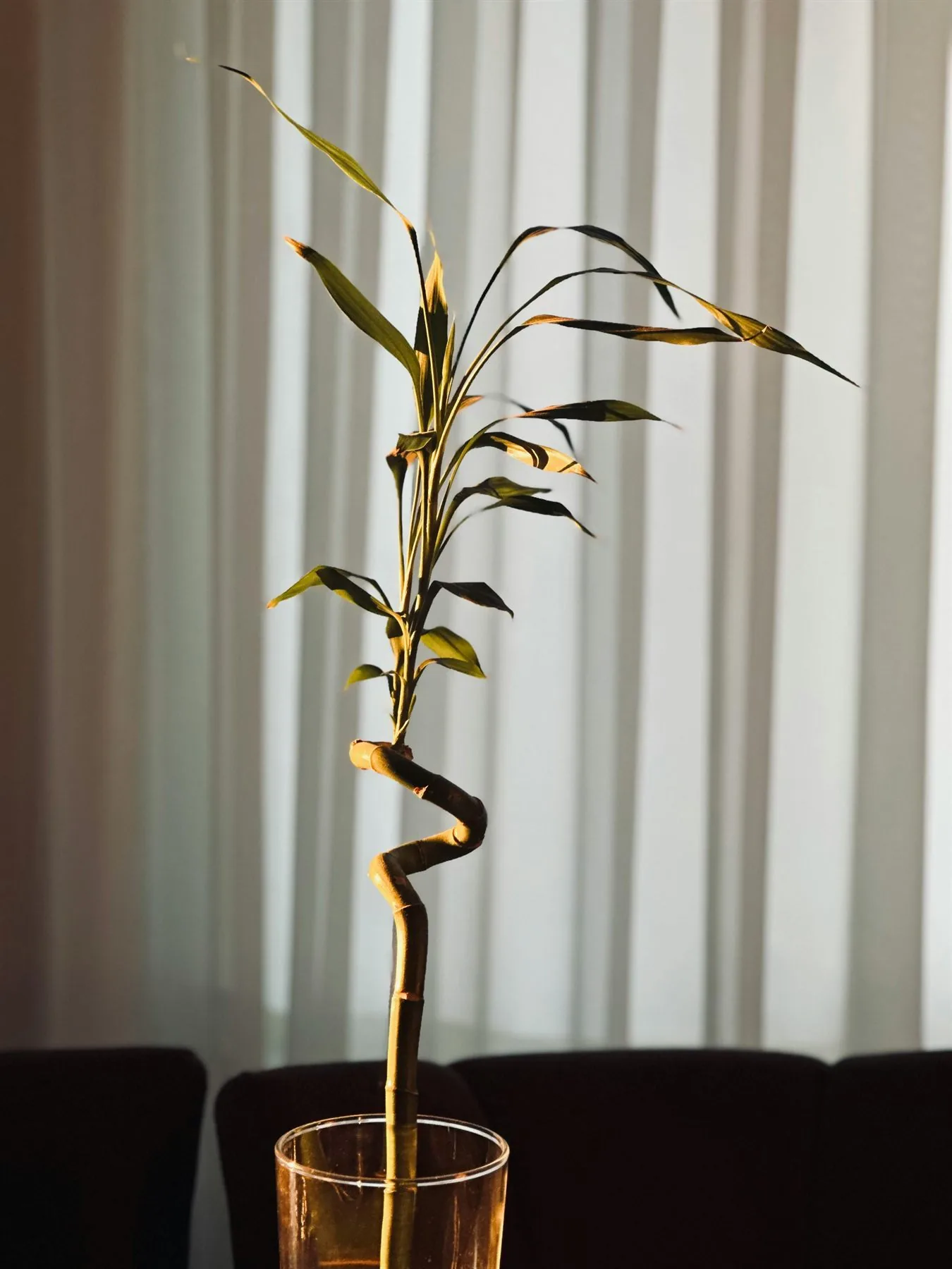
Green
Growth and replenishment
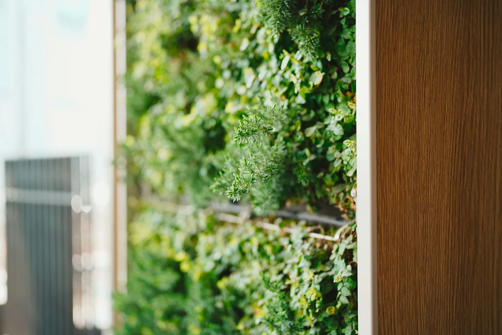
Green + Cream + Walnut
The easiest main money color for walls, upholstery, cabinetry, or even one strong anchor piece.
Muted teal
Flow with polish
Muted teal + Greige + Soft gold
A useful supporting option if you want the money color to feel a little cooler without turning into plain blue.
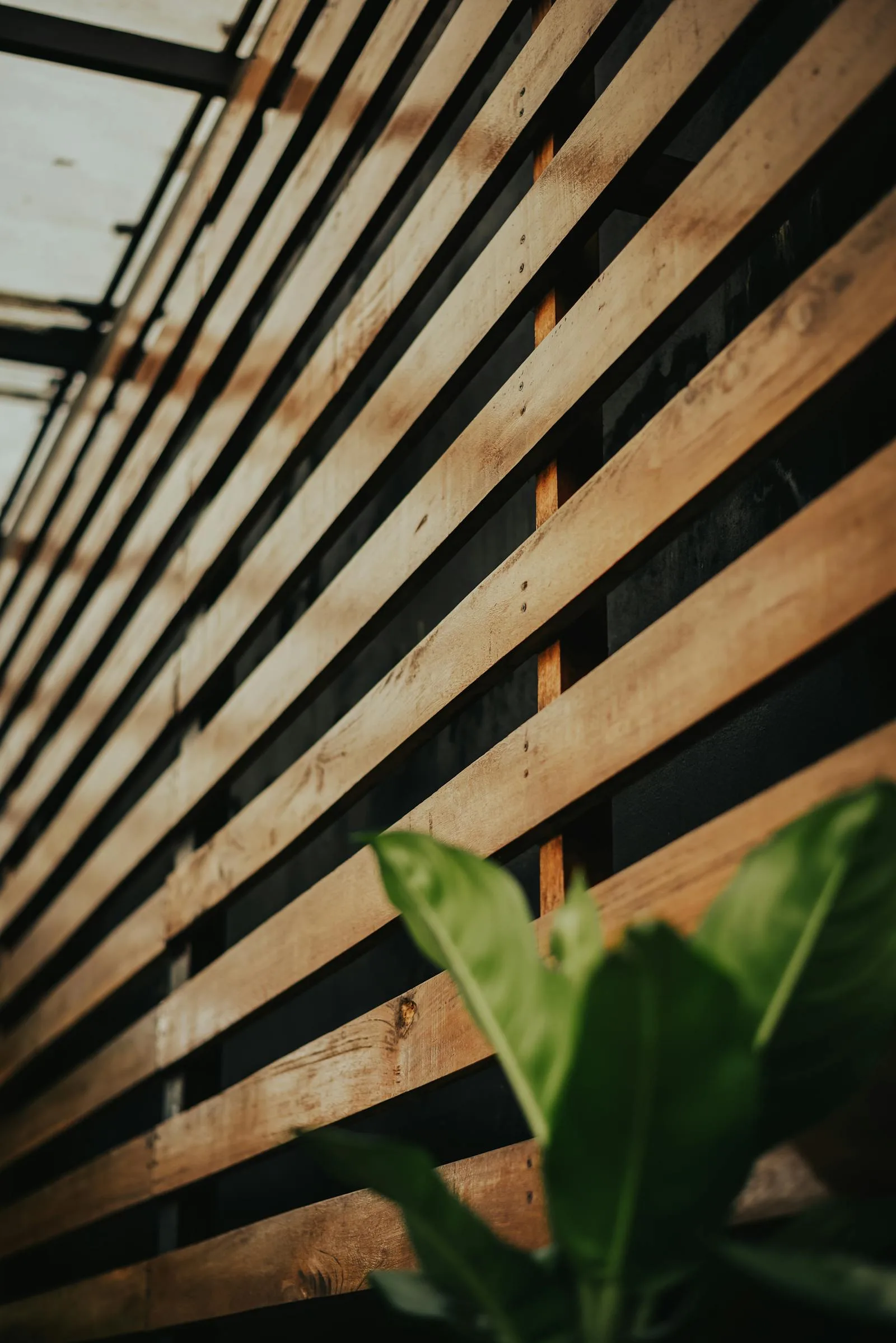
Deep wood brown
Rooted value
Deep wood brown + Green + Cream
Strong through wood furniture, shelving, picture frames, and darker grounding elements that make the money color feel established.
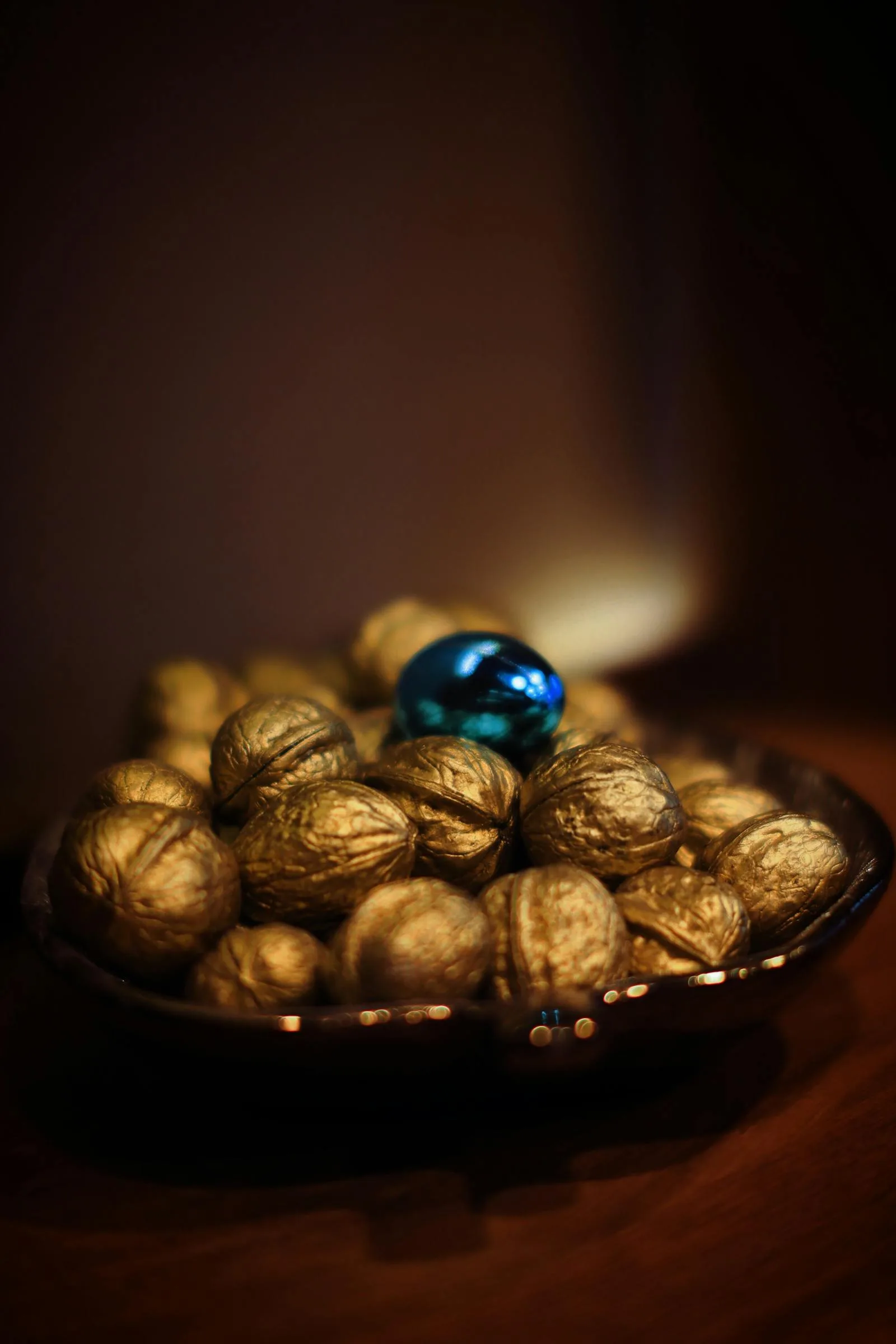
Soft gold
Value in smaller doses
Soft gold + Green + Cream
Best as a metal finish, lamp base, bowl, frame, or smaller styling detail instead of the whole room.
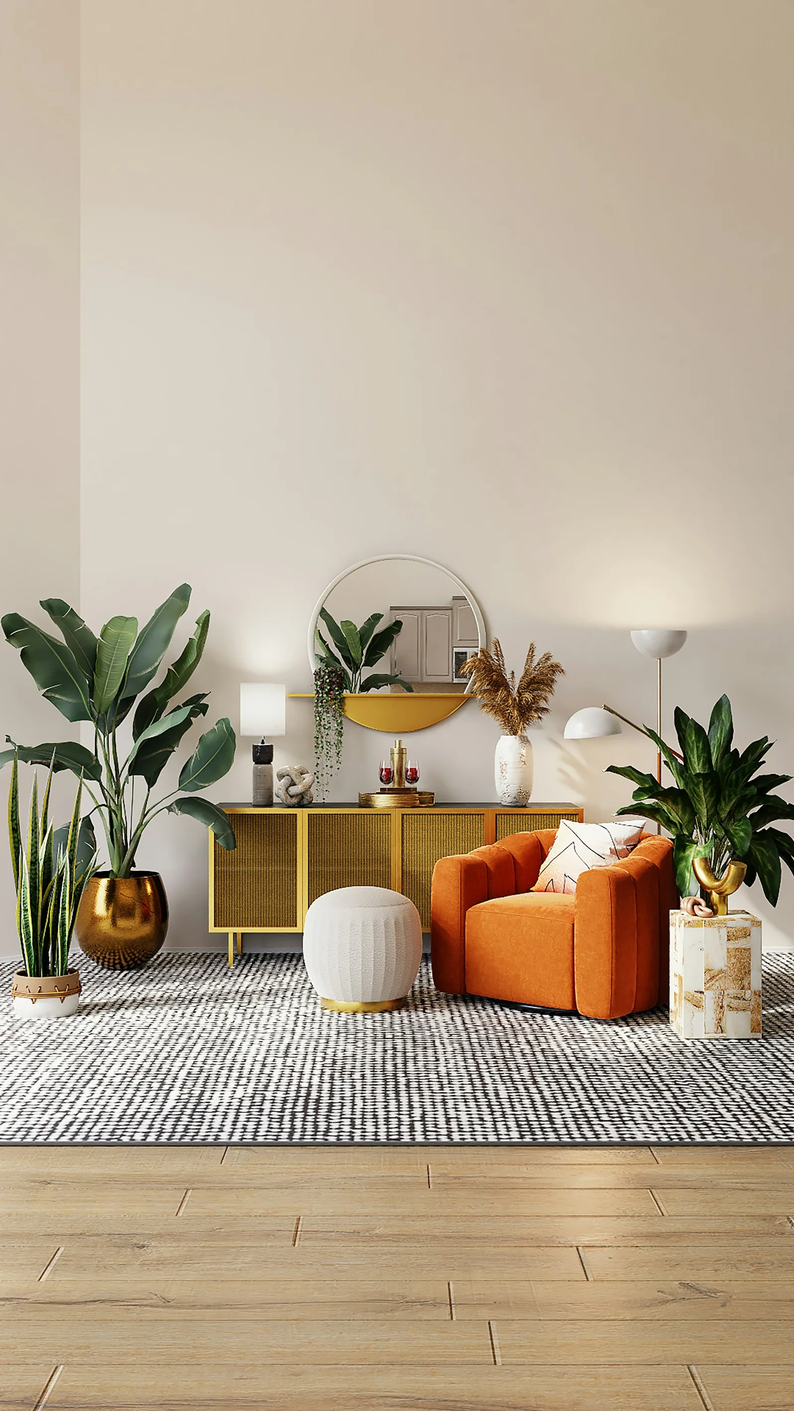
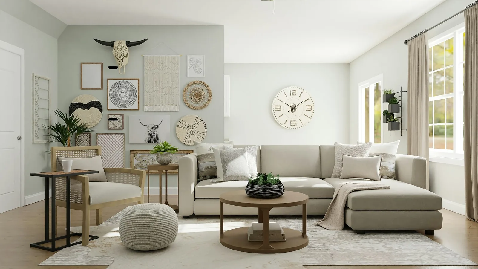
When to Choose One Money Color Instead of an Abundance Palette
Scroll sideways to compare all columns.
| Decision | Best approach | What the room should show |
|---|---|---|
| You want one obvious money-color answer | Choose green as the lead color. | One green wall, chair, cabinet, artwork, or plant grouping with cream and wood nearby. |
| You want the entire room to feel generous and layered | Build an abundance palette instead. | Green or teal, warm cream, rich wood, clay, light, and a restrained metallic detail. |
| You only want to activate a specific area | Keep the existing room palette and add one edited cue. | A healthy plant, useful lamp, green object, or meaningful artwork, not a collection of cures. |
What About Gold, Purple, Red, Black, and Blue?
Green is the easiest practical answer, but many money-color searches mention gold, purple, red, black, and blue too. Those colors can work, but they need a clearer job. Gold is best as value and polish. Purple reads richer and more ceremonial. Red activates, so it should stay small. Black and deep blue add depth, but too much can make the room feel heavy.
Scroll sideways to compare all columns.
| Color | Role | Best use |
|---|---|---|
| Green | Main money color | One wall, chair, cabinet, plant grouping, artwork, or clear decor anchor. |
| Soft gold | Value accent | Lamps, frames, bowls, hardware, and other small metallic details. |
| Purple or plum | Richer prosperity note | Art, textiles, flowers, or one small decorative layer. |
| Red | Activation | A small spark rather than the main palette for a restful room. |
| Black or deep blue | Depth and flow | Small grounding accents when the room already has enough light. |
| Cream and wood | Stabilizer | The surrounding base that keeps every symbolic color natural and settled. |
How to Build Around the Money Color So It Still Looks Good
Three money-color formulas that feel believable
Steady prosperity
Forest green + Cream + Walnut
A dependable formula for a living room, office, or money-corner zone that should feel richer without getting theatrical.
Brighter abundance
Muted teal + Greige + Soft gold
Useful when the room gets more daylight and you want the money color to feel lighter.
Edited wealth cue
Cream + Deep wood + Soft gold
Helpful when the money color is mostly carried by decor instead of the walls.
The easiest money-color ratio
70% base
Cream or soft greige
A calm base makes it easier for the money color to feel intentional instead of overpowering.
20% support
Green or muted teal
Let the main money color show up in one clear place, like upholstery, cabinetry, or a stronger wall.
10% accent
Soft gold or deeper wood
Use the richer note in lighting, frames, bowls, or one stronger furniture detail.
Where to Use Money Colors at Home
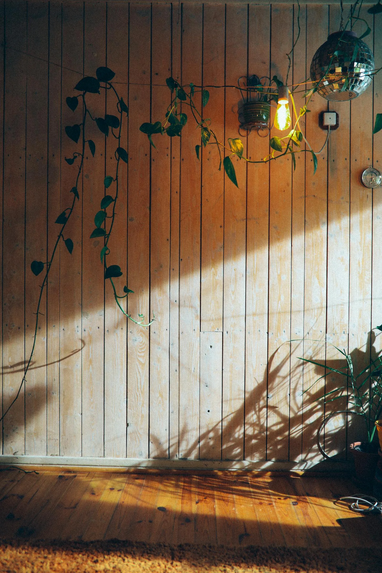
Money color becomes more useful when it has a place. A green chair in a living room, a soft gold lamp near a desk, a wood shelf with one healthy plant, or a richer framed artwork can all make the idea feel intentional. Sprinkling lucky colors everywhere has the opposite effect.
Scroll sideways to compare all columns.
| Place | Try | Why it works |
|---|---|---|
| Living room | One green chair, plant grouping, artwork, or calmer accent wall. | The color stays visible without taking over daily life. |
| Office or desk | A green plant, wood organizer, soft-gold lamp, or rich frame. | The work area gains one steady cue without becoming distracting. |
| Entry console | One healthy plant, clean bowl, warm light, and an edited surface. | The first impression reads cared for before it reads symbolic. |
| Money corner | Green, wood, useful light, and one polished accent. | The corner feels alive and maintained rather than overloaded with cures. |
What Goes Wrong With Money Color
The symbol should not outrun the room
A color does not help much if it makes the room feel louder, darker, or more artificial than you can comfortably live with.
What helps
- +Let green be the main money direction if you want one clear answer.
- +Use wood and cream so the money color still feels natural in the room.
- +Keep metallic gold in smaller doses instead of making it the whole palette.
- +Match the money color to a space that already feels cared for.
What weakens the effect
- -Using bright money symbolism in a room that still feels cluttered or neglected.
- -Relying on gold or red alone to carry the whole idea.
- -Forcing a darker money color into a room with too little light.
- -Treating one color as more important than upkeep, light, and flow.
If you want the broader abundance palette version of this, go to colors that attract abundance. If you want the room and item side of the same idea, the closest reads are feng shui for money, feng shui money corner, and feng shui wallet color.
Frequently Asked Questions
What feng shui color attracts money most?
Can gold attract money in feng shui?
Is red a money color in feng shui?
How do I use a money color without overdoing it?
The Bottom Line
If you want one feng shui color that attracts money, start with green. It is the easiest answer because it carries growth, life, and replenishment without pushing the room too hard.
The strongest money palette still needs support around it. Cream, deeper wood, muted teal, and soft gold help the money color feel richer and more believable in a real home.