



Quick Answer
The best feng shui room colors change with the room. Bedrooms need softer, quieter color. Kitchens tend to work well with lighter, fresher tones. Living rooms often want grounded warmth. Offices need more disciplined calm than the rooms meant for gathering.
A room color guide is more useful when it starts with function instead of symbolism. The room should feel better after the color goes in, not just more aligned on paper.
That is why room colors work best when you decide what the room is for first. A living room needs comfort and conversation. A bedroom needs a quieter nervous system. A kitchen needs freshness and nourishment. One palette cannot solve all of that the same way.
This page is the room-selection layer. Use the feng shui color chart when you need the meaning of a color or its element; use the whole-home color guide when several rooms need to connect. Once you choose a room below, follow its applied palette guide for surfaces, light, and proportions. If you are deciding what to reduce or replace, start with feng shui colors to avoid.
How to Choose Feng Shui Colors by Room
Start with the room's emotional goal. Do you want the room to feel open, restful, grounded, nourishing, or focused? Once that is clear, color choices become easier and more believable.
Scroll sideways to compare all columns.
| Room | What it should feel like | Easiest color direction |
|---|---|---|
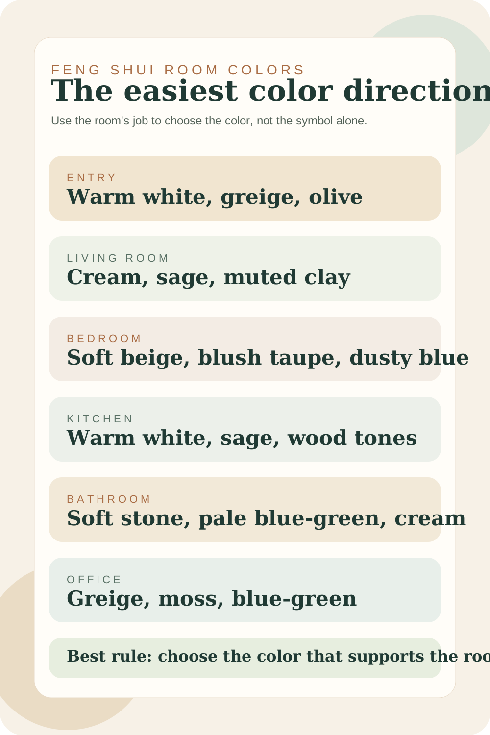
| Entry | Clear and welcoming | Warm white, greige, olive, muted blue-gray |
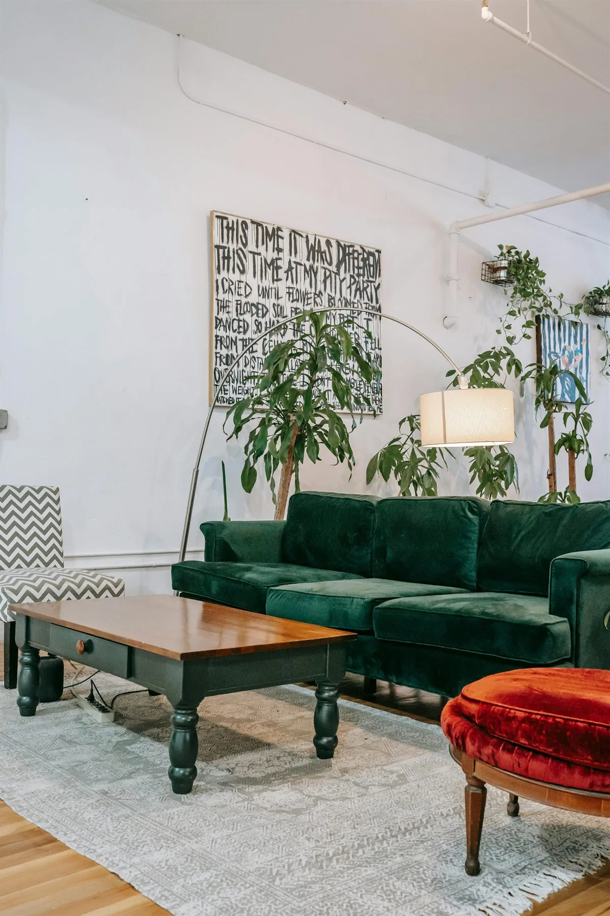
| Living room | Comfortable and grounded | Cream, sage, mushroom, muted clay |
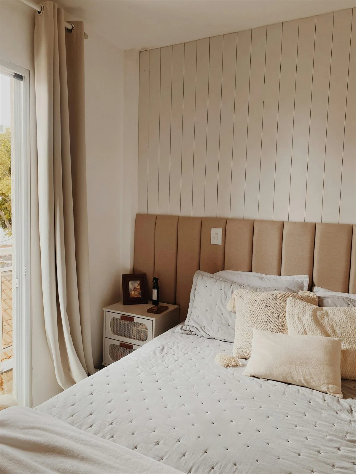
| Bedroom | Restful and soft | Warm beige, taupe, blush-neutral, dusty blue |
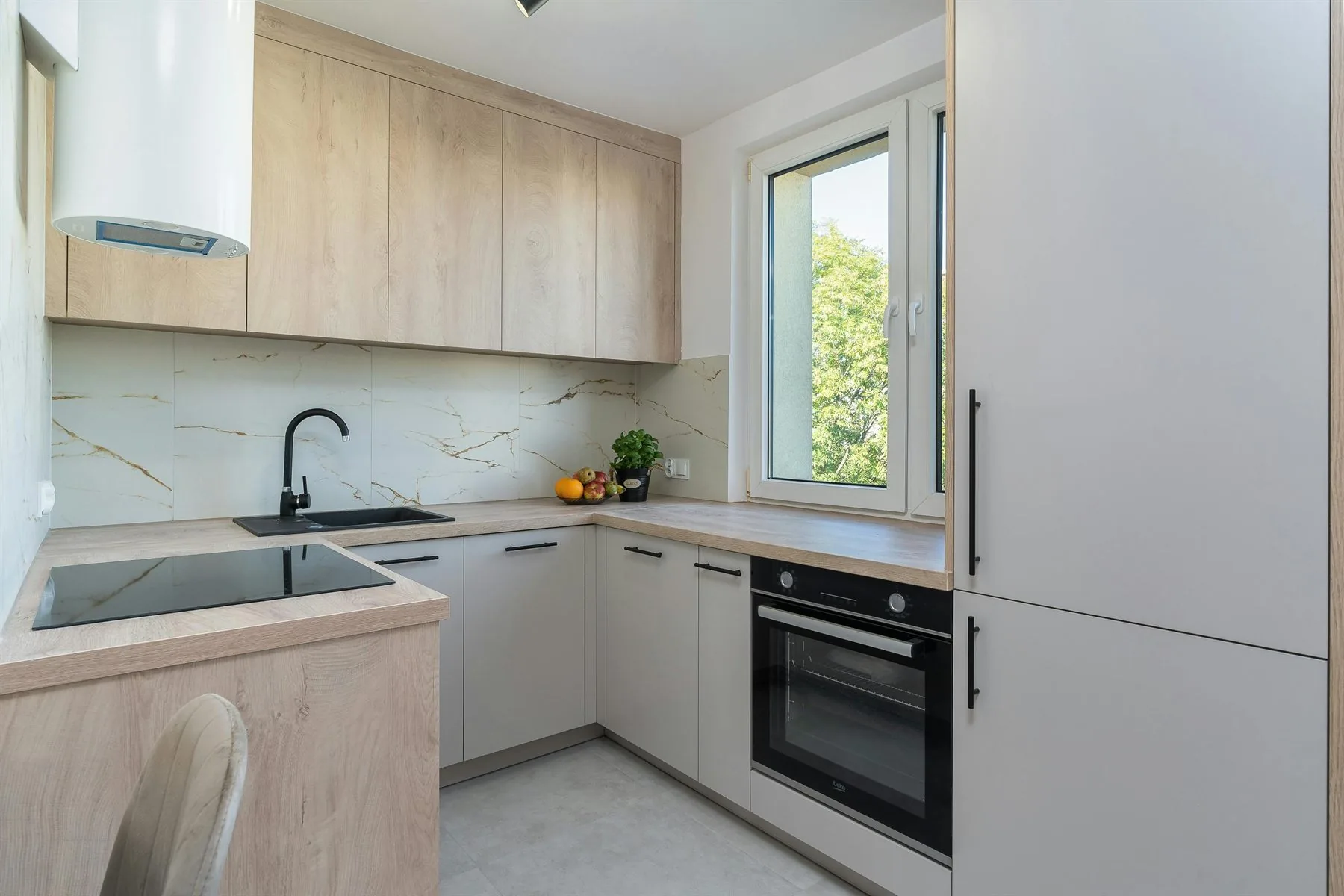
| Kitchen | Fresh and nourishing | Warm white, pale sage, wood, light greige |
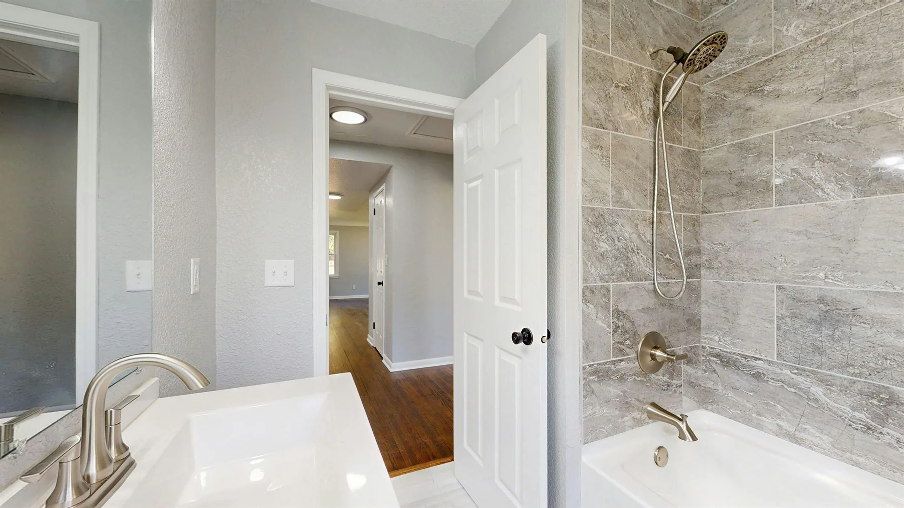
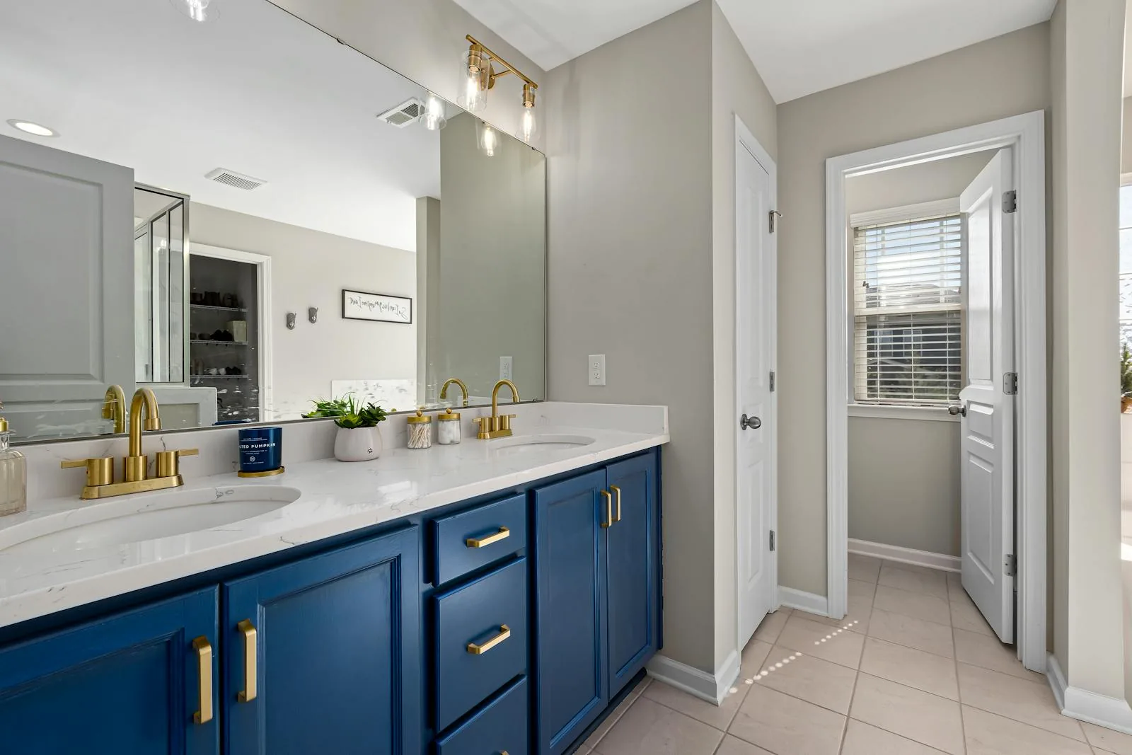
| Bathroom | Fresh and clean | Stone, pale blue-green, soft cream |
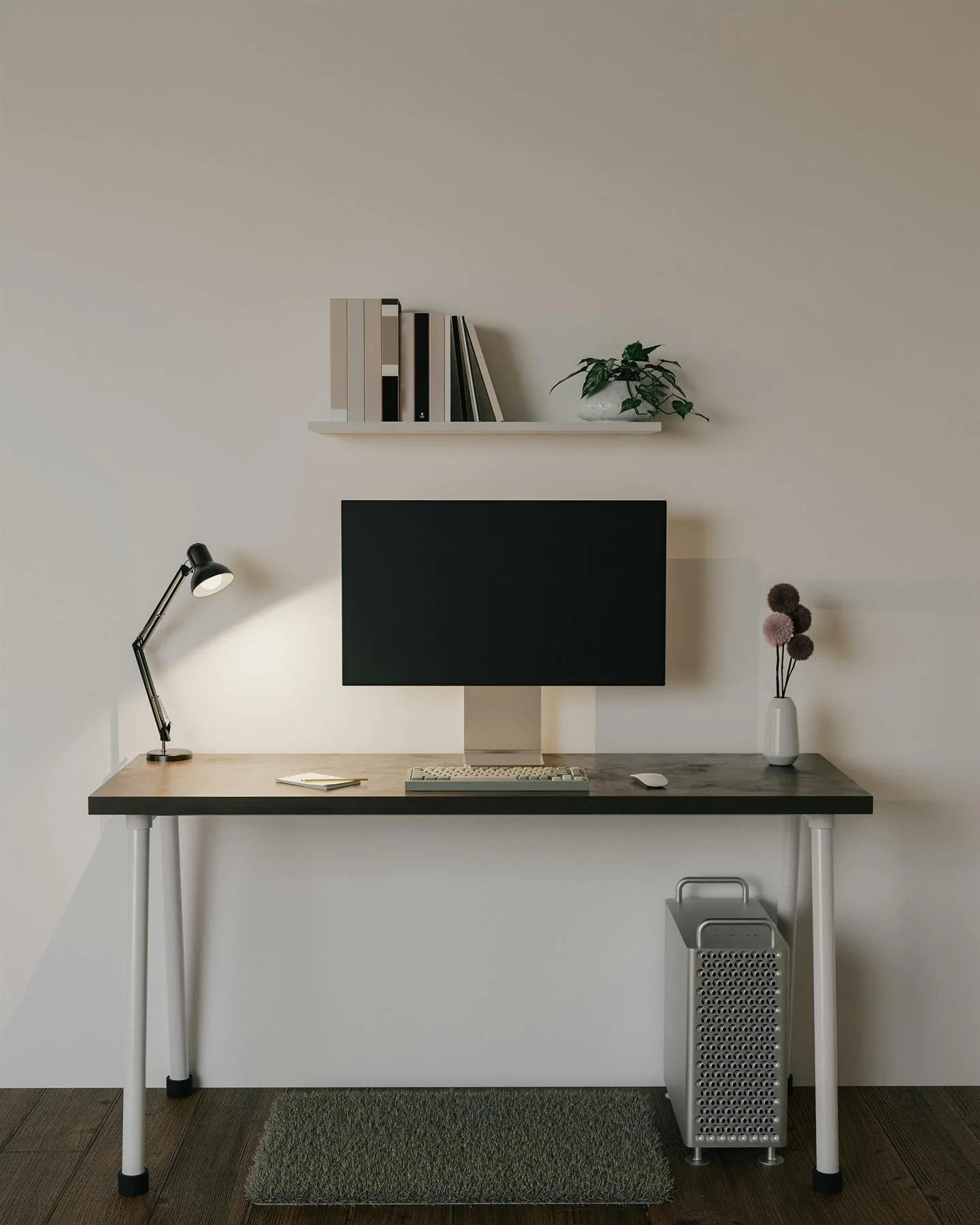
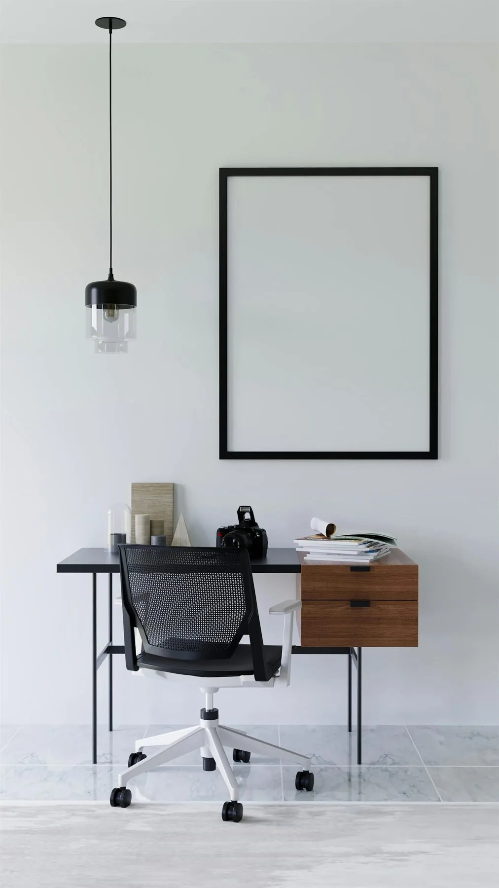
| Office | Calm and focused | Greige, moss, blue-green, walnut |
The Five Elements Behind Room Colors
Feng shui color choices make more sense when you understand the five elements behind them. You do not need to paint every wall by a strict chart, but the element language helps explain why some colors feel lively, steady, fresh, crisp, or quiet in a specific room.
Wood
Greens, blue-greens, plants, and natural wood tones support growth, renewal, and a softer sense of movement. They fit entries, living rooms, kitchens, and work areas especially well.
Fire
Reds, coral, bright pink, sharp orange, and strong lighting add visibility and activation. Use them carefully in bedrooms and already-bright rooms so the palette does not feel restless.
Earth
Cream, beige, taupe, clay, stone, and sandy neutrals create steadiness. They are the easiest base for bedrooms, living rooms, dining rooms, and any room that needs more calm.
Metal and Water
Whites, soft grays, metallic finishes, deep blue, black, and watery blue tones can sharpen focus or quiet the room. They work best when balanced with warmth, texture, or wood.
A Practical Room-by-Room Color Guide
The easiest room-color families
Think of these as safer directions rather than strict rules.
Warm white and greige
Open and forgiving
Warm white and greige + Oat + Oak
Best in entries, hallways, and bathrooms where the room needs more breath and easier visual flow.
Sage and mushroom
Grounded and lived-in
Sage and mushroom + Cream + Walnut
Strong for living rooms, some kitchens, and offices that need more life without more noise.
Warm beige and taupe
Restful and enveloping
Warm beige and taupe + Rose taupe + Clay
Best in bedrooms where the room needs softness more than brightness or drama.
Dusty blue-green
Cool relief
Dusty blue-green + Greige + Moss
Helpful in brighter bedrooms, bathrooms, and offices when the space needs visual cooling with softer edges.
Whole-Home Palette Directions That Still Let Rooms Shift
Most homes feel better when the room colors stay related instead of trying to make every room identical. The easiest way to do that is to choose one broader palette family for the house, then let each room lean warmer, softer, fresher, or more focused inside that family.
Three easier ways to keep the house connected
These are useful whole-home directions when you want room-by-room variation without visual disconnect.
Warm connected neutrals
Soft and unified
Warm connected neutrals + Cream + Sand
Best when you want the whole home to feel calmer and lighter, then add room personality through wood, textiles, and a few deeper accents.
Quiet greens and woods
Grounded and lived-in
Quiet greens and woods + Moss + Walnut
Helpful when the house needs more natural life and steadiness, especially across living rooms, entries, kitchens, and work areas.
Cooler blue-green relief
Airier and quieter
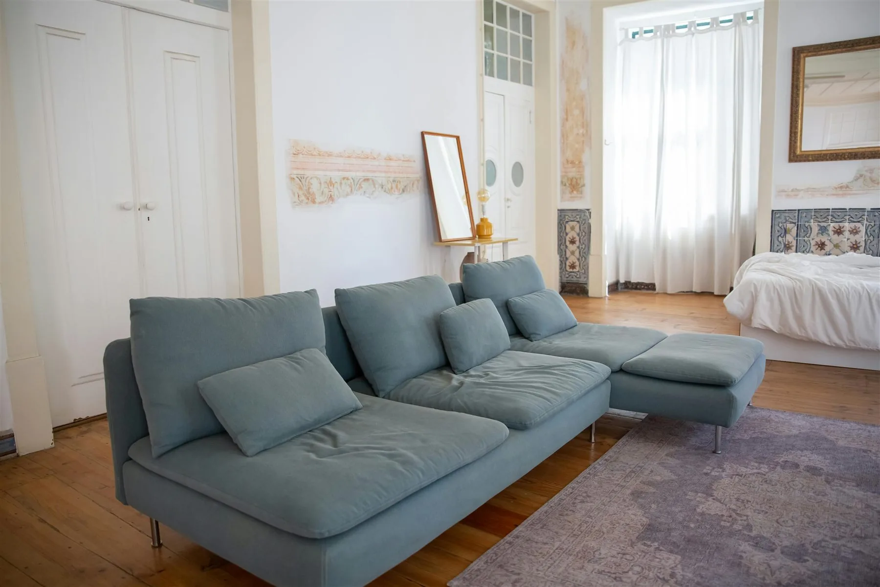
Cooler blue-green relief + Stone + Fog blue
Best in brighter homes where you want relief from heat or glare, especially in bathrooms, offices, and some bedrooms.
Use Color by Role, Not Just by Symbol
Give each room color a clear job
Best base color
Warm white, greige, or soft beige
Base colors should help the eye relax and give the room enough breathing room to hold furniture, art, and texture well.
Best support color
Sage, moss, or blue-green
Support colors are often strongest through upholstery, cabinetry, drapery, or one grounded wall rather than every surface.
Best warm accent
Clay, rose taupe, brass, or walnut
Accent colors add life and warmth, but they work best in smaller doses that support the room instead of taking it over.
If you want the deeper version for a specific room, the best follow-up reads are feng shui colors for living room, feng shui colors for bedroom, feng shui colors for kitchen, feng shui colors for bathroom, feng shui colors for office, and feng shui entryway colors.
Most common room-color mistake
A room color becomes less useful when it is chosen only for symbolism and not for the room's real mood, light, and job.
Frequently Asked Questions
What are the best feng shui room colors?
Should every room have the same feng shui color?
What room needs the calmest color palette?
What is the easiest color mistake to avoid?
The Bottom Line
The best feng shui room colors are the ones that help each room do its job. Bedrooms want softness, kitchens want freshness, living rooms want grounding, and offices want steadier focus.
Use color room by room, then keep the undertones connected enough that the whole home still feels like one place.