



Quick Answer
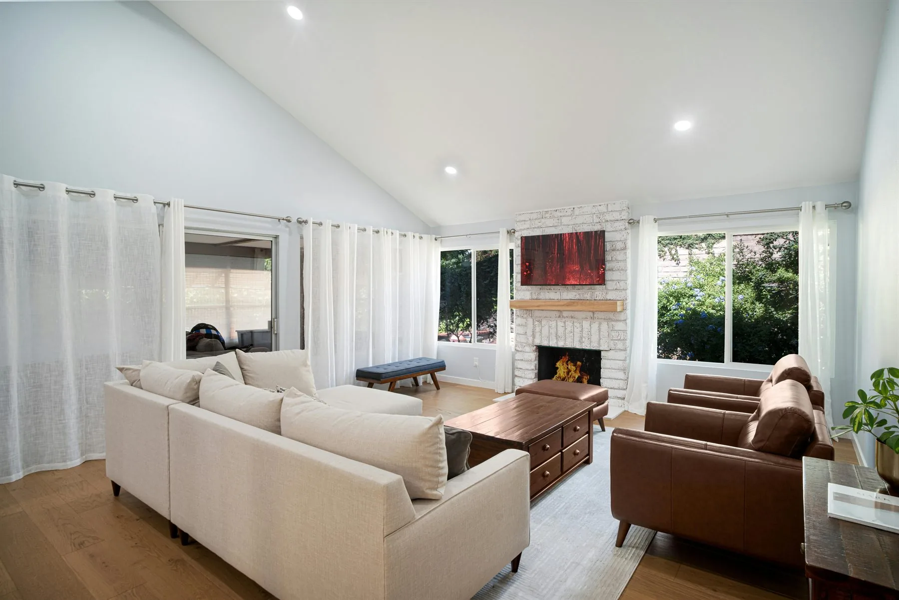
The best feng shui home interior colors begin with one warm, breathable base, then layer in one grounding support tone and one smaller warm accent. That is what helps interiors feel connected, calmer, and more intentional instead of flat or overly themed.
Interior color gets easier once you stop treating the walls as the whole story. Most rooms feel good because the wall color, wood tone, upholstery, curtain fabric, and light all agree with each other.
In feng shui terms, that agreement matters. A room feels steadier when the palette reads as one idea instead of six unrelated moves. Good interior color does not have to be bland. It just needs a calm hierarchy.
Interior Color Directions That Work Best
The strongest feng shui interiors tend to stay a little warmer and more grounded than trend-led rooms that chase stark white, icy gray, or loud contrast. The room should still feel soft enough to live in.
Interior colors that are easiest to build around
These are the shades that help interiors feel more connected room to room.
Warm cream
Open and softer
Warm cream + Oat + Walnut
A dependable wall field for living rooms, halls, and brighter open spaces that need warmth more than drama.
Soft greige
Quiet and connecting
Soft greige + Mushroom + Oak
A strong bridge color when the home has mixed woods, multiple seating fabrics, or more transitional architecture.
Muted sage
Grounded and restorative
Muted sage + Cream + Clay
Useful when you want the interior to feel more lived-in and rooted without adding a louder earth tone everywhere.
Dusty blue-green
Calm with relief
Dusty blue-green + Greige + Moss
Helpful in hot, bright rooms that need visual coolness, as long as warmer materials still repeat through the room.
Clay accent
Welcoming and human
Clay accent + Cream + Brass
Best in art, pottery, cushions, lamp bases, and smaller upholstered moments rather than every wall.
Use the Five Elements Without Making the Home Look Themed
Feng shui color advice often starts with the five elements: Wood, Fire, Earth, Metal, and Water. That does not mean every room needs obvious red, black, green, white, and yellow. In real interiors, the elements work better as a quiet layer behind the palette.
Scroll sideways to compare all columns.
| Element | Interior colors | Best home use | Keep it balanced |
|---|---|---|---|
| Wood | Green, sage, olive, warm brown | Living areas, plant corners, family rooms, reading zones | Use with cream, clay, or wood texture so green does not feel flat. |
| Fire | Clay, terracotta, coral, muted red | Dining rooms, art moments, lamp light, small accents | Keep it edited. Too much fire color can make a room feel restless. |
| Earth | Cream, beige, sand, taupe, ochre | Walls, rugs, upholstery, bedrooms, transitional spaces | Add enough texture and contrast so earth colors do not turn dull. |
| Metal | Warm white, soft gray, pearl, brushed brass | Offices, bathrooms, kitchens, trim, hardware, cleaner details | Warm it with wood, fabric, or lamplight so it does not feel clinical. |
| Water | Deep blue, blue-green, charcoal, softened black | Quiet corners, entry accents, art, powder rooms, reflective details | Use dark water colors as depth, not as a heavy ceiling over the room. |
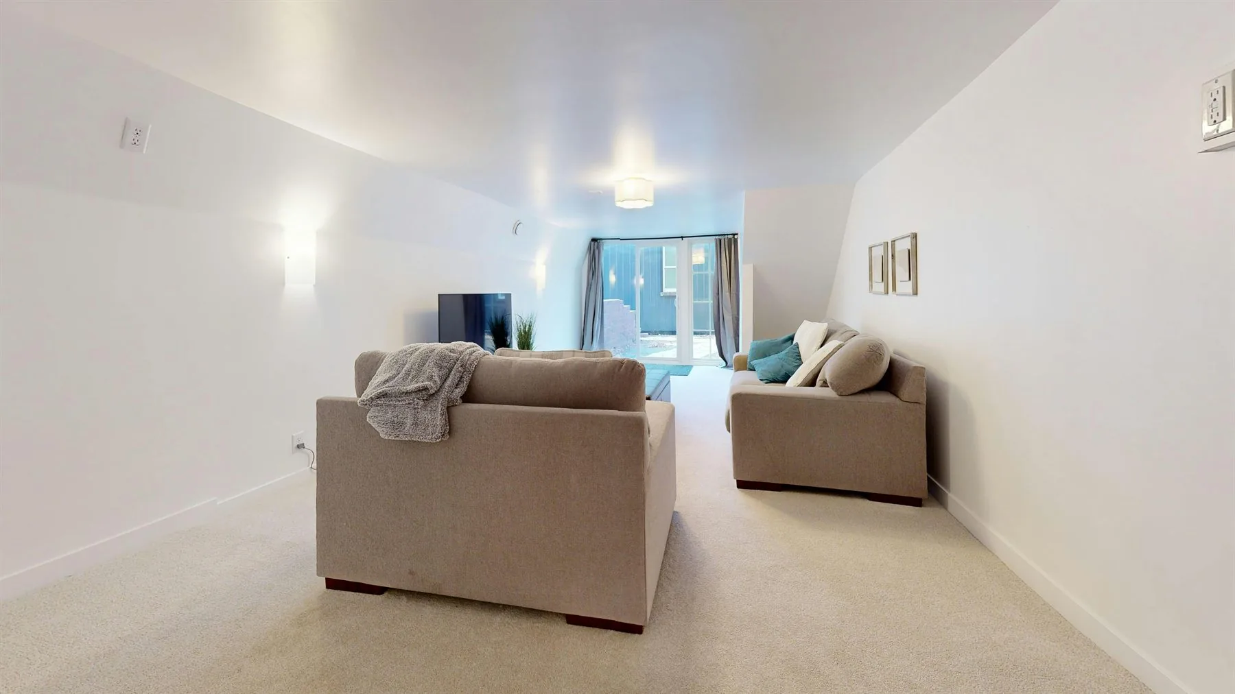
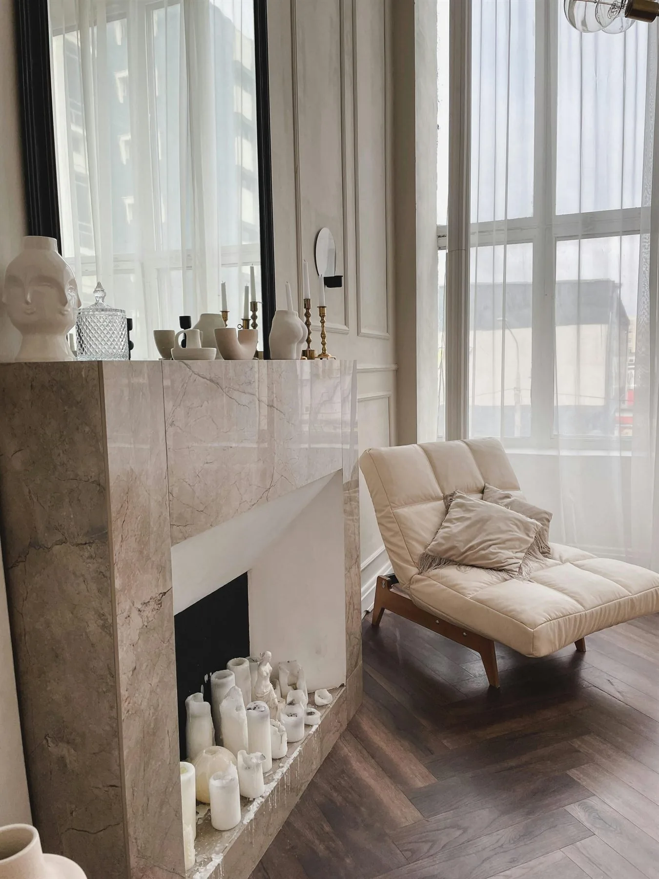
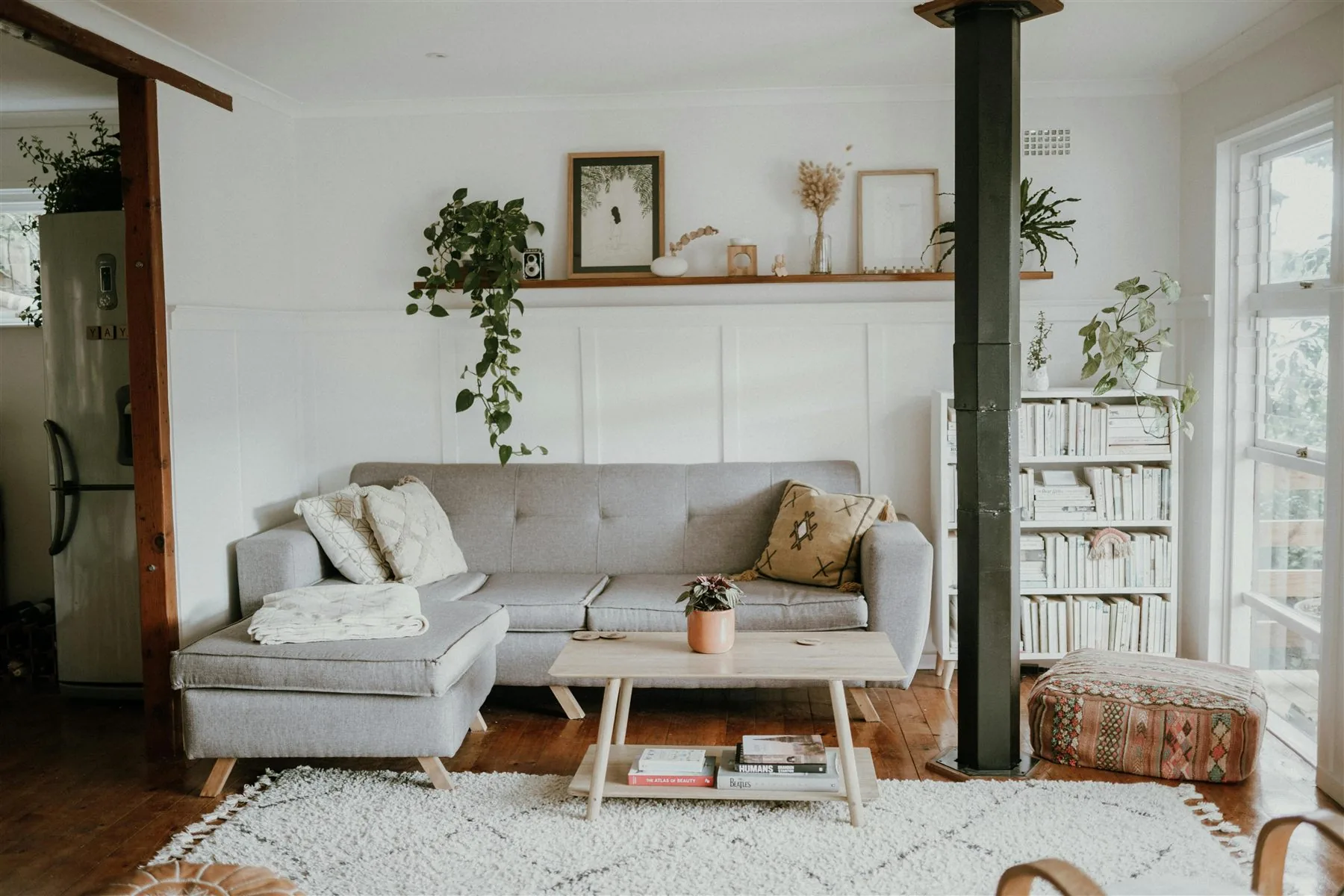
Three interior palette families that feel grounded
Warm and airy
Warm cream + Oat + Walnut
Best for brighter homes that want softness and visual ease more than contrast.
Quiet and rooted
Greige + Sage + Oak
Good for interiors that want more weight and calm without becoming dark or heavy.
Cool relief with warmth
Blue-green + Cream + Clay
Useful in bright homes when blue-green is balanced by cream, wood, and one warmer accent.
Give Each Interior Color One Job
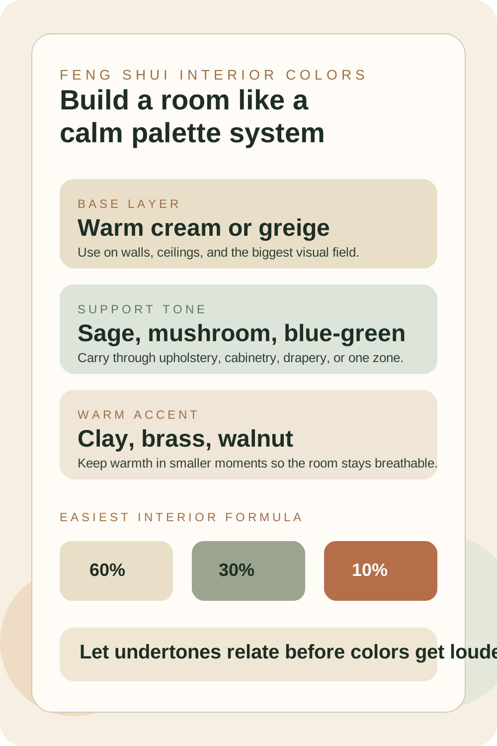
Interior color breaks down when too many colors try to be the star at the same time. A calmer approach is to let one shade lead, one shade support, and one smaller accent keep the room alive.
A practical interior design color ratio
60% base
Warm cream or greige
Use the calmest neutral on the walls, larger upholstery field, or biggest continuous surfaces.
30% support
Sage, mushroom, or blue-green
Carry the support tone through cabinetry, an area rug, drapery, or one larger furniture grouping.
10% accent
Clay, brass, or darker wood
Let the smaller accent add life through art, lamp bases, pottery, side chairs, or trim details.
The three jobs that keep interiors balanced
Best wall and envelope color
Warm cream or soft greige
This is the color that keeps the room breathable and gives every other material a calmer place to land.
Best furniture or cabinet color
Muted sage, mushroom, or blue-green
The support tone gives the room its grounded personality without forcing every surface to carry strong color.
Best warmth-building accent
Clay, brass, or walnut
Warm smaller accents keep the room from feeling washed out and help the interior feel more human and layered.
A Room-by-Room Interior Color Map
A whole-home palette should repeat, but it should not flatten every room into the same mood. Let the main colors stay related, then shift the weight of each color according to what the room asks you to do there.
Scroll sideways to compare all columns.
| Room | Best color direction | Why it works |
|---|---|---|
| Entryway | Warm neutral base with one clear accent | The first view feels settled, readable, and welcoming instead of visually noisy. |
| Living room | Cream, greige, sage, wood, and one warmer accent | The room can hold conversation, rest, and daily movement without feeling either cold or busy. |
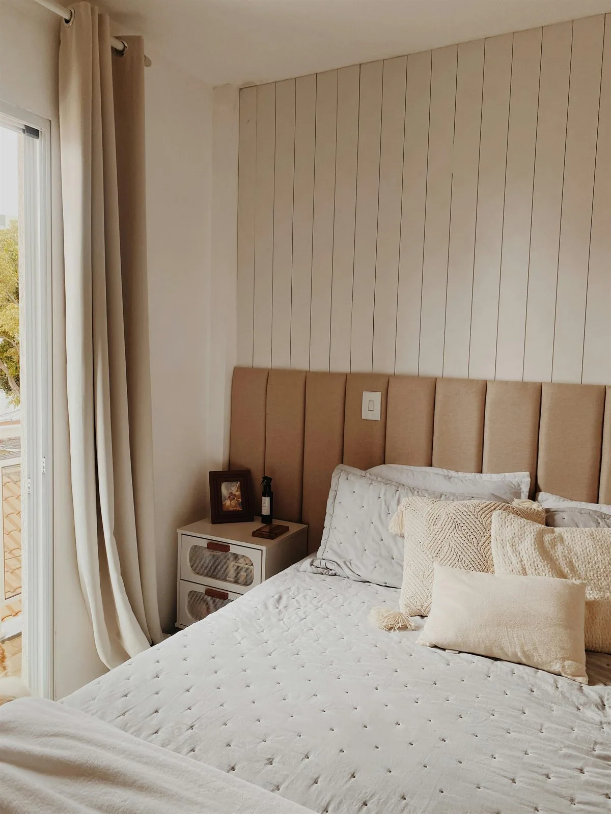
| Bedroom | Softer earth tones, muted greens, warm whites, gentle taupes | The palette supports rest by lowering contrast and keeping the room less visually alert. |
| Kitchen | Light wood, warm white, soft stone, restrained green or clay | Kitchen color feels clean but still nourishing, especially when the finishes avoid harsh contrast. |
| Bathroom | Fresh warm white, pale stone, soft gray-green, light wood | The room feels clean and fresh without becoming cold, slippery, or disconnected from the home. |
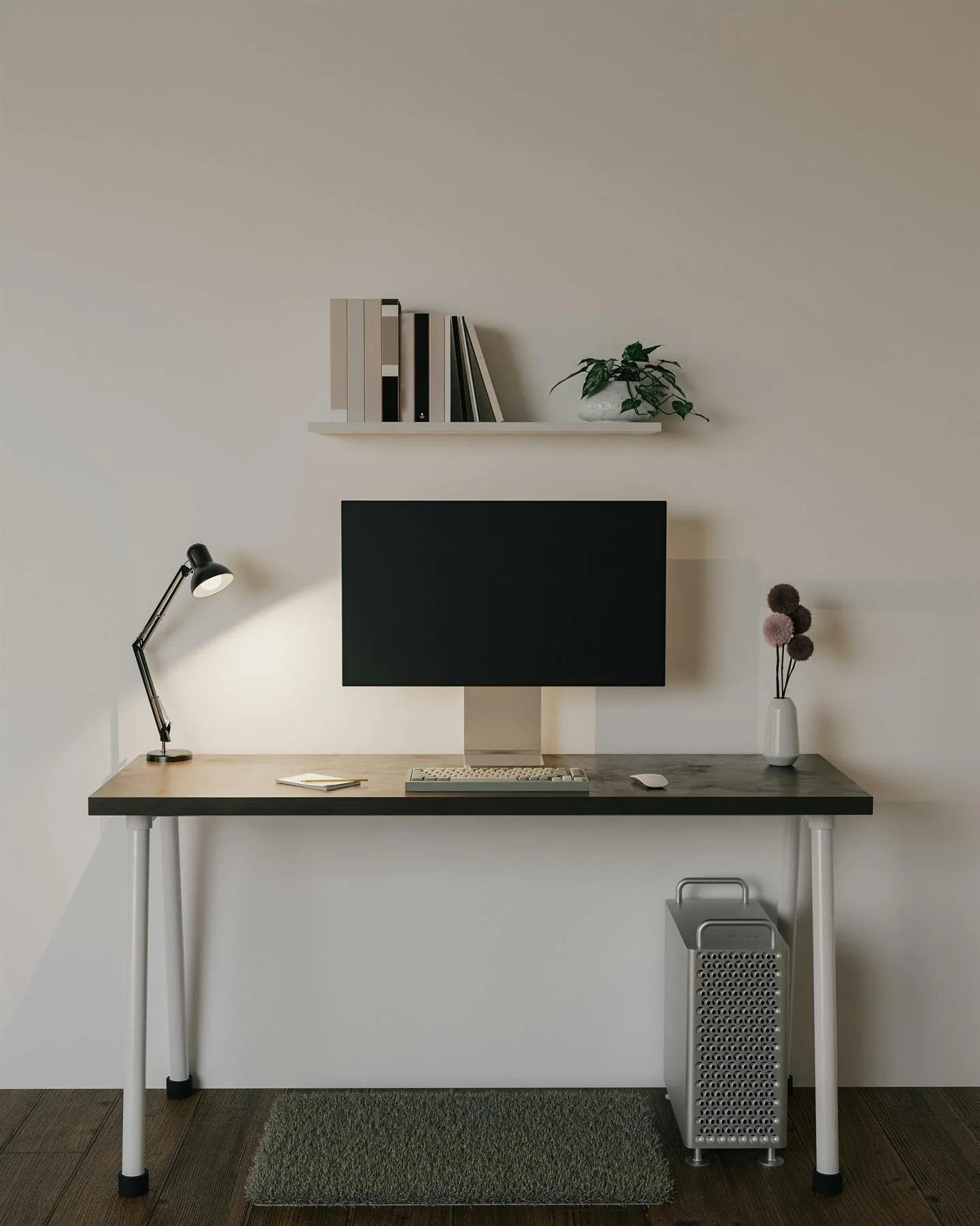
| Home office | Greige, mushroom, olive, walnut, charcoal in small doses | The work area gains structure while still belonging to the rest of the interior palette. |
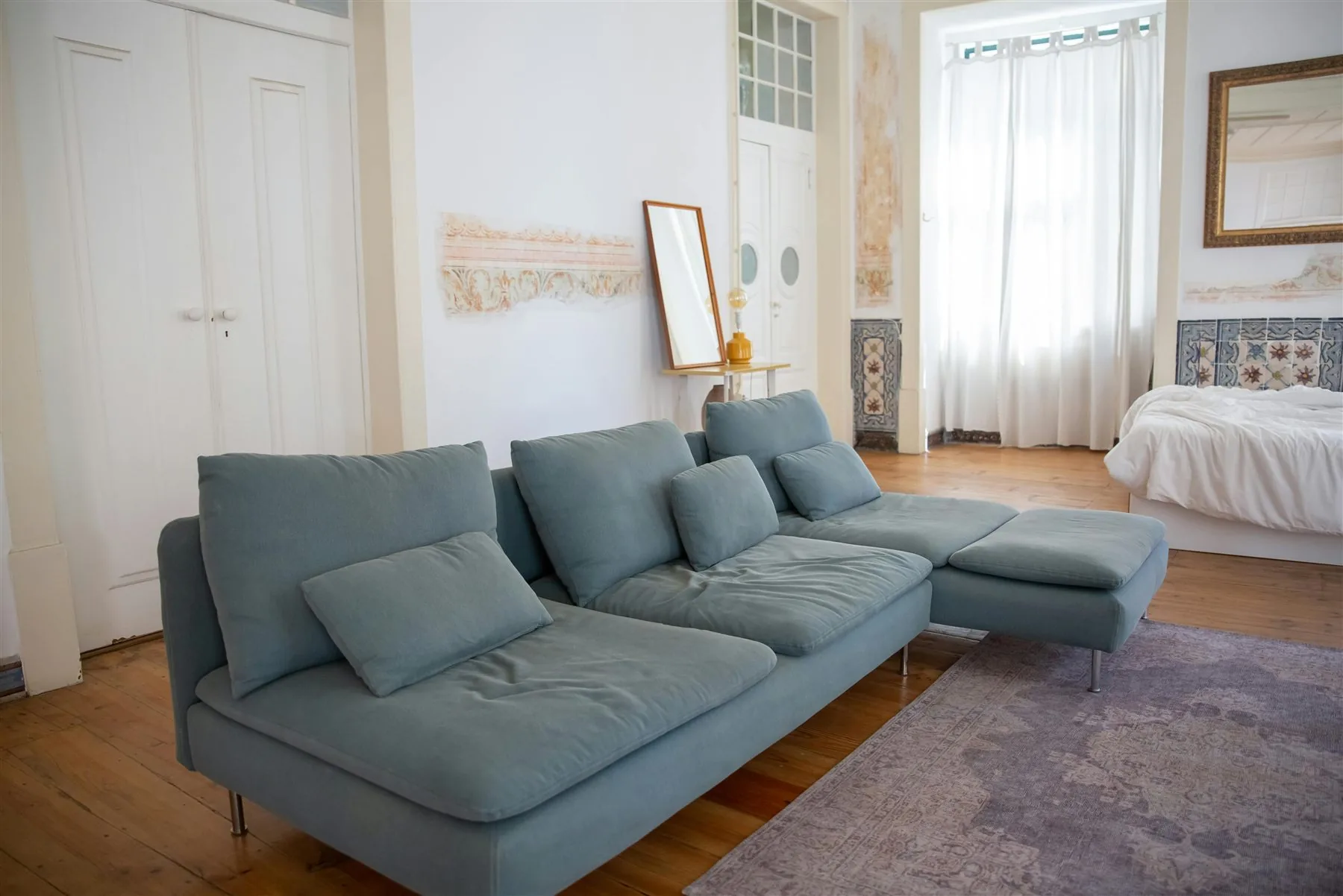
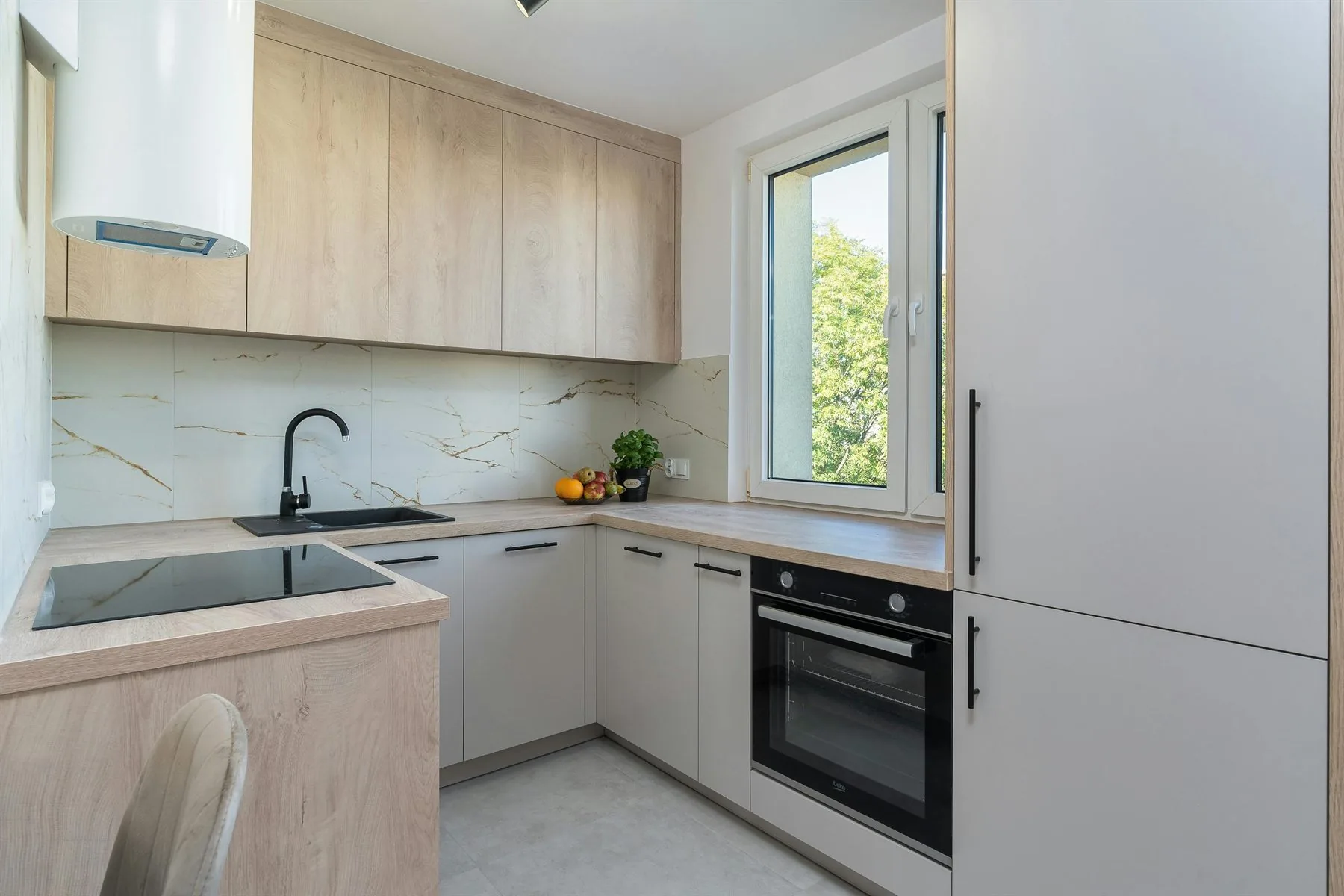
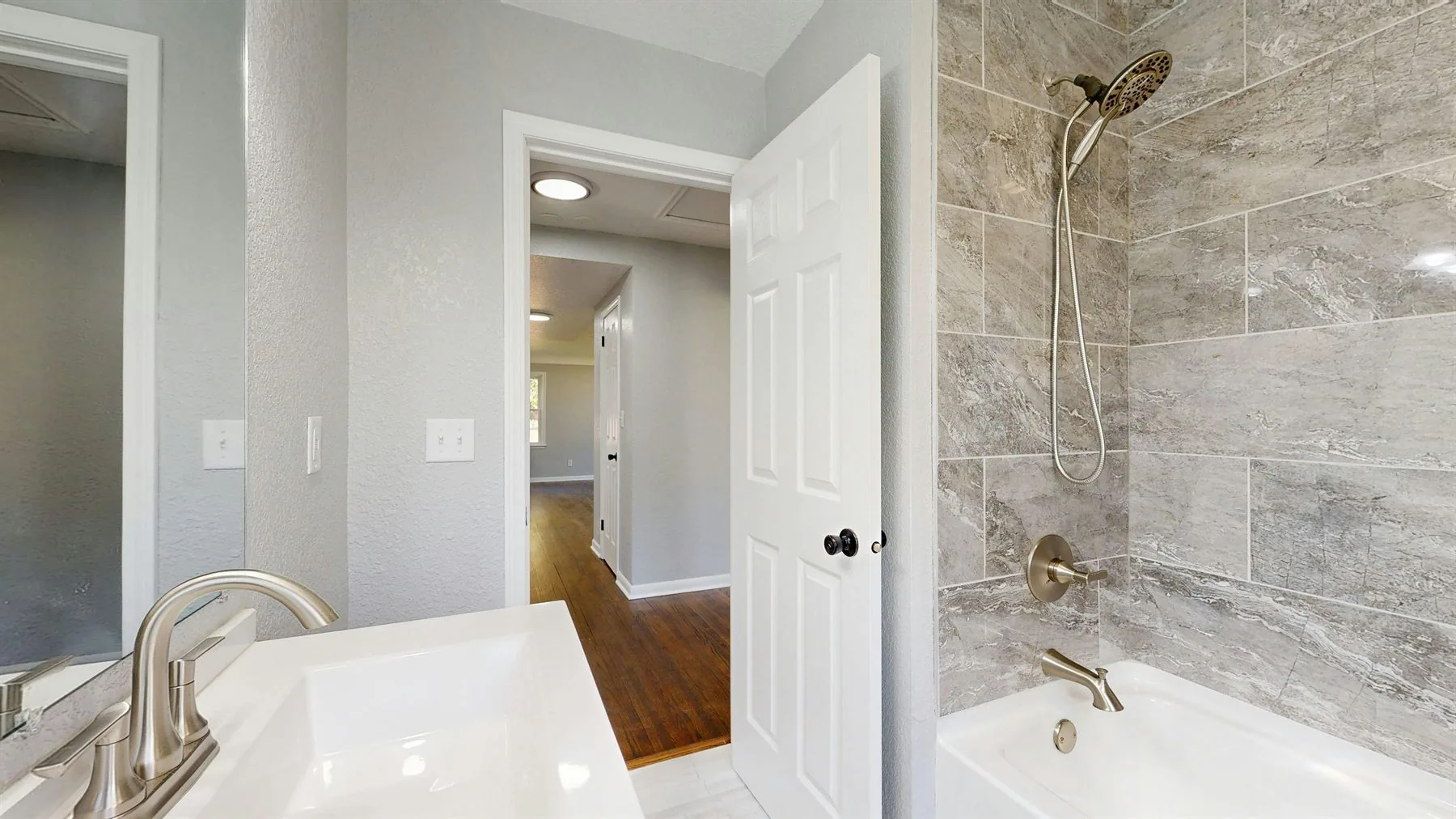
If you want a broader whole-house version of this topic, feng shui colors for home stays more general. If you want room-level palette help, the best follow-ups are feng shui color palette ideas, feng shui colors for living room, and feng shui entryway colors.
Interior Colors to Use More Carefully
Stronger color is not the problem by itself. The bigger issue is when the room has no calm bridge between sharper hues, bright undertones, metal finishes, and upholstery. That is when interiors start to feel scattered.
Be careful with rigid directional formulas too. A south room does not automatically need more red, and a north room does not have to become dark blue. Direction and element ideas can guide the palette, but the room's light, use, size, flooring, and furniture still decide how much color it can comfortably hold.
A common interior color mistake
Avoid this
Icy gray + Harsh black + Sharp red
When several strong undertones all fight for attention, the room can start to feel nervous even if each piece is attractive on its own.
Try this instead
Warm cream + Greige + Sage
A warmer neutral field plus one cooler or greener support tone lets the room hold contrast without feeling jumpy.
Frequently Asked Questions
What are the best feng shui home interior colors?
Should every room use the same feng shui color?
What weakens feng shui interior color?
How do I make home colors feel more connected?
The Bottom Line
The best feng shui home interior colors work more like a design system than a single lucky color. Start with one calm base, give one support tone a clear role, and let the warmer accent stay edited.
When the undertones, materials, and room-to-room shifts all relate to each other, the interior starts to feel calmer without losing character.