



Quick Answer
The feng shui colors to avoid are the ones that make the room feel harsher, louder, darker, or colder than it needs to. Harsh white, cold gray, aggressive red, and too much black are the most common troublemakers, but the real test is still how the room feels once the color takes over.
A color is rarely bad in a vacuum. It becomes a problem when it makes the room harder to relax in, harder to connect in, or harder to soften with the furniture and light you actually have.
That is why the better question is not which colors are forbidden. It is which colors are easiest to overdo. In real homes, the hardest colors push the room toward glare, flatness, visual heaviness, or constant stimulation.
The Colors That Cause the Most Trouble
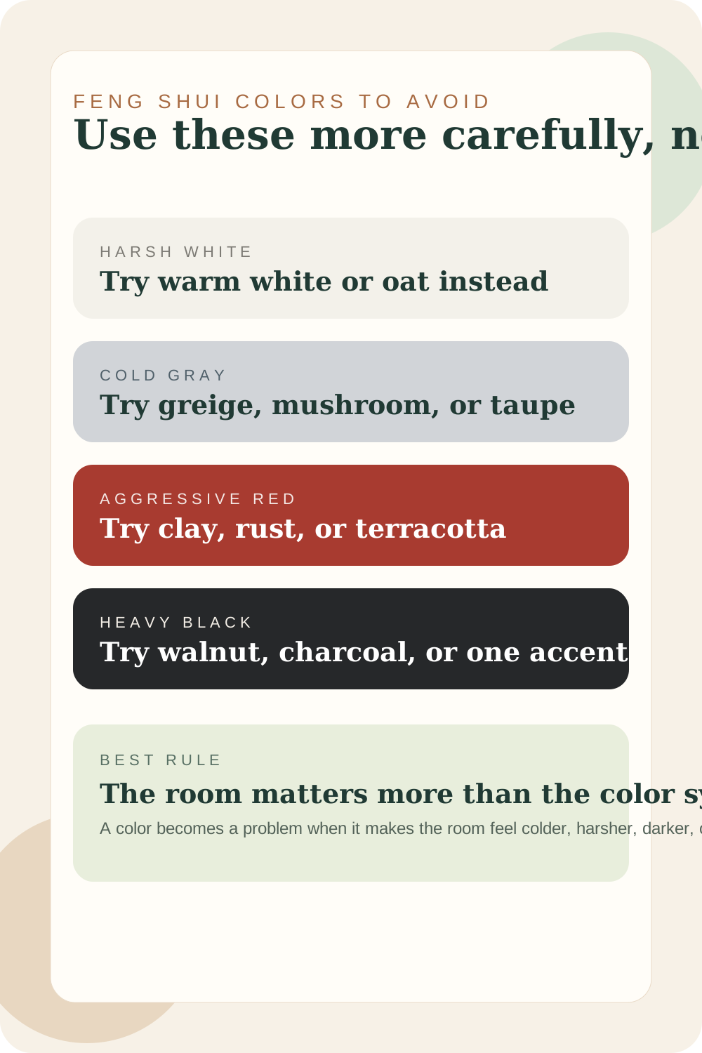
Use these colors more carefully
None of these are automatic deal-breakers. They just become difficult faster when the room already has stress points.
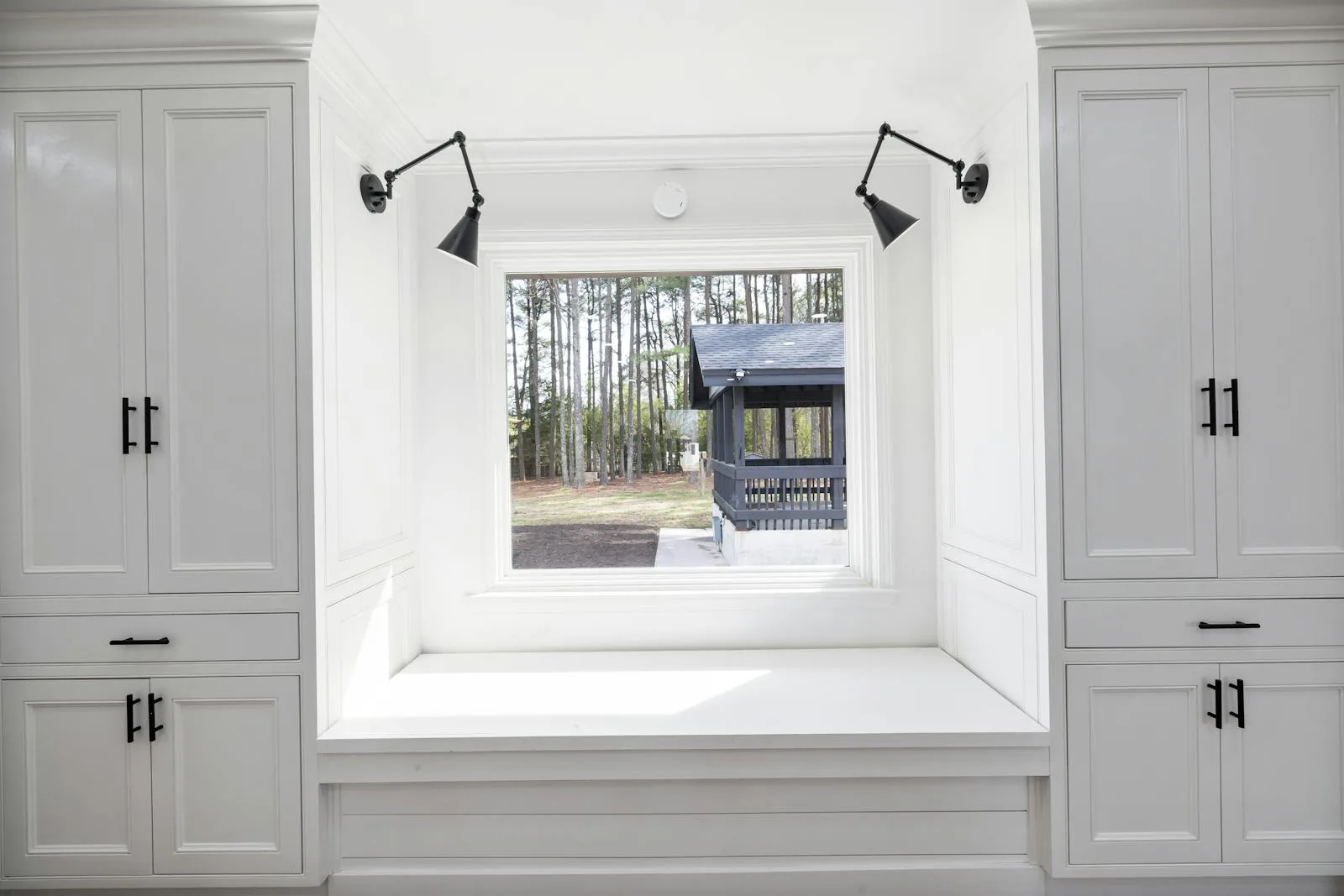
Harsh white
Too stark
Harsh white + Warm white + Oat
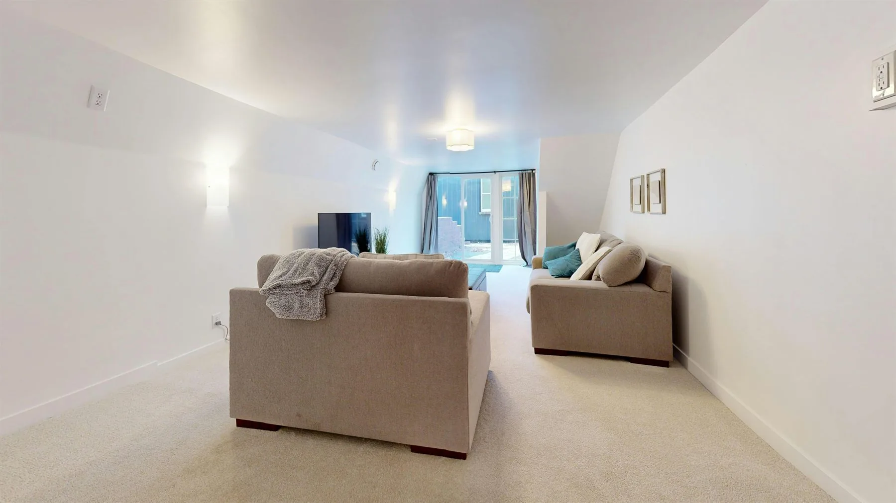
The issue is not white itself. The issue is a white that feels sterile, glaring, or too sharp against cooler light.
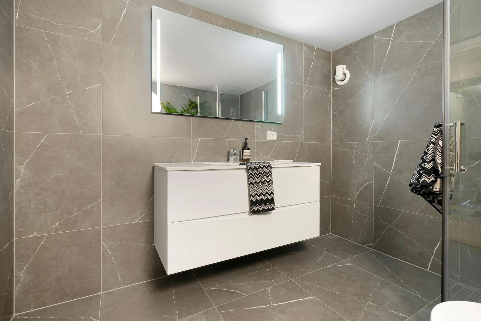
Cold gray
Too drained
Cold gray + Greige + Mushroom
Gray can flatten a room quickly when the house already lacks warmth, sunlight, or natural wood to soften it.
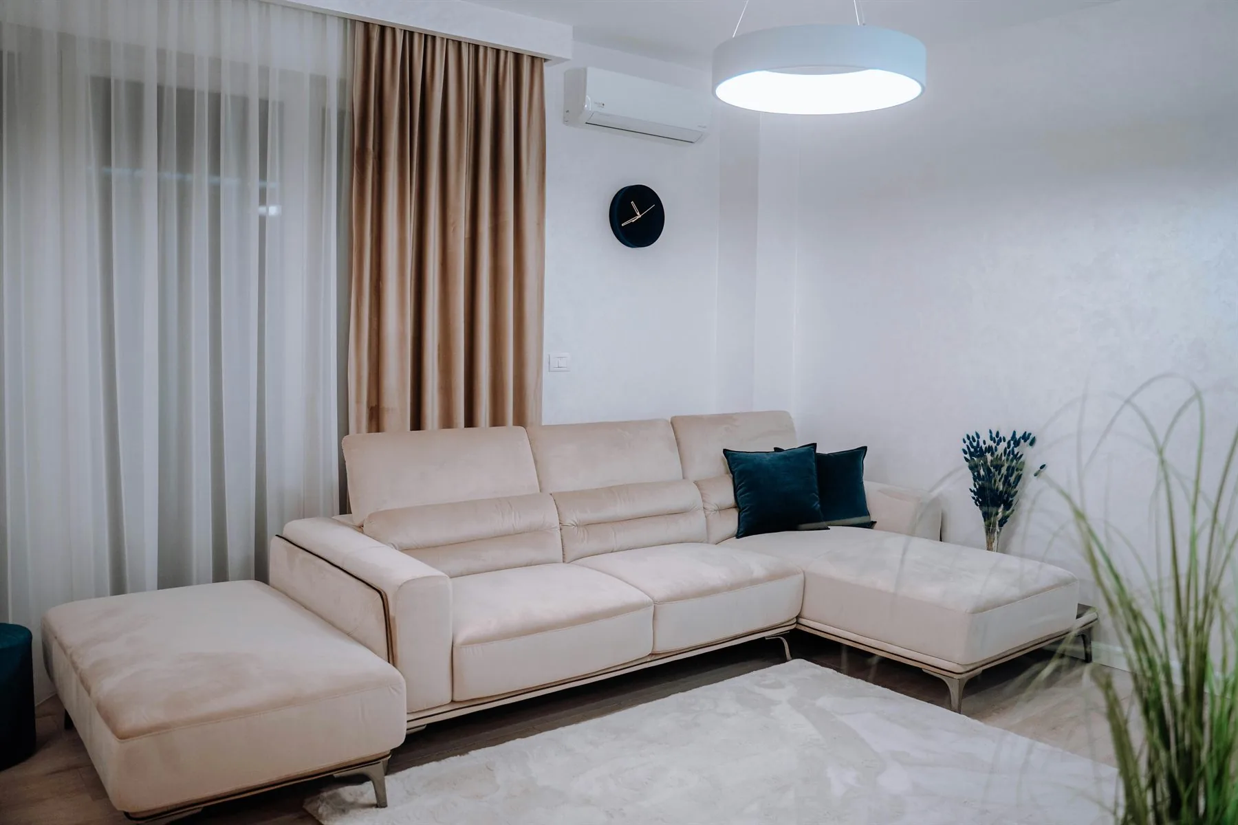
Aggressive red
Too activated
Aggressive red + Clay + Rust
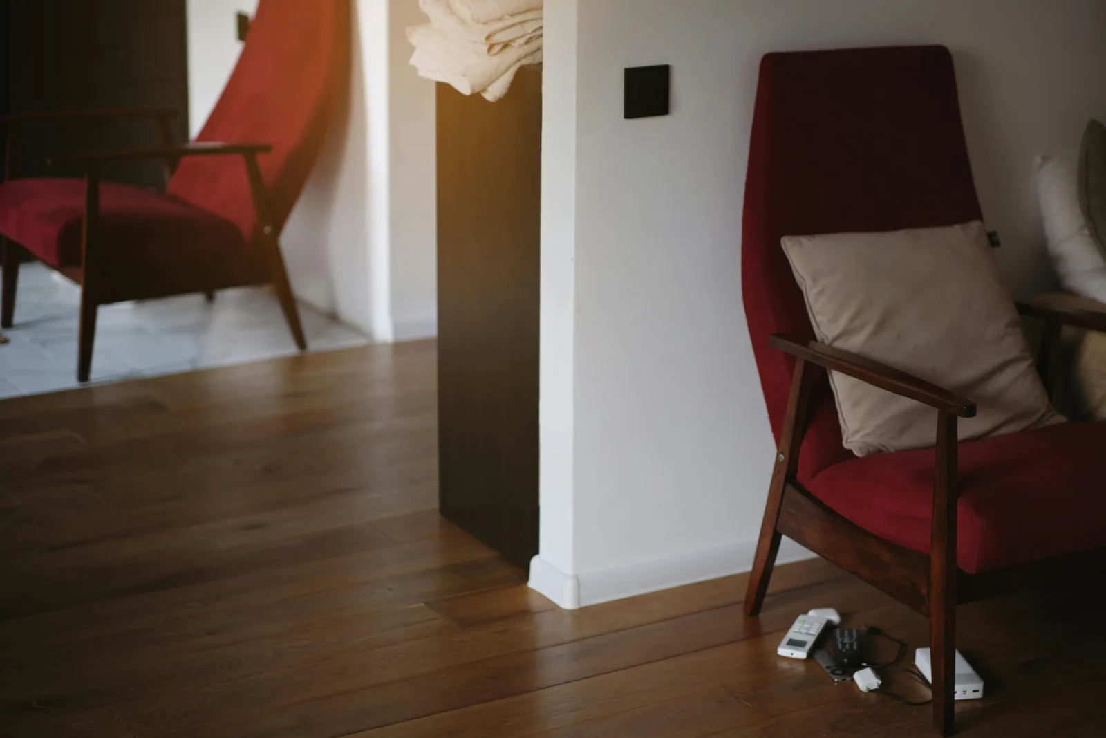
Stronger red works better in controlled accents than across big walls, upholstery, or highly visible zones.
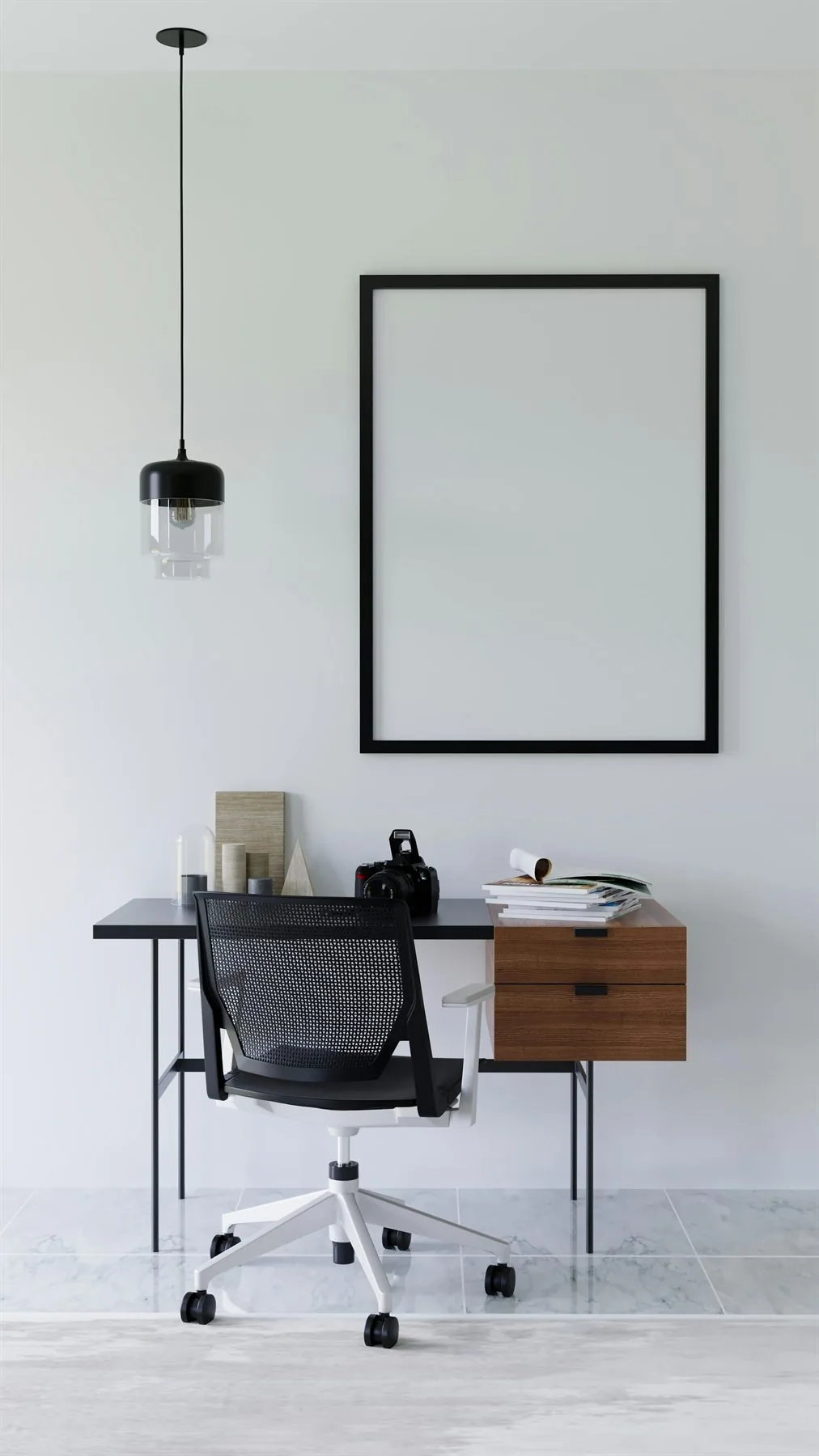
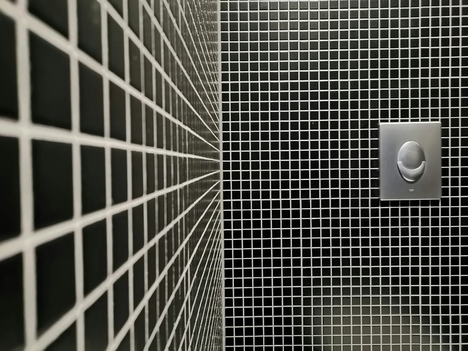
Heavy black
Too closed-in
Heavy black + Walnut + Charcoal
Black can feel rooted in small doses, but too much black can make a room feel visually shut down if it already reads dark.

What to Use Instead So the Room Still Feels Good
The common color mistake
Avoid this
Harsh white + Cold gray + Red
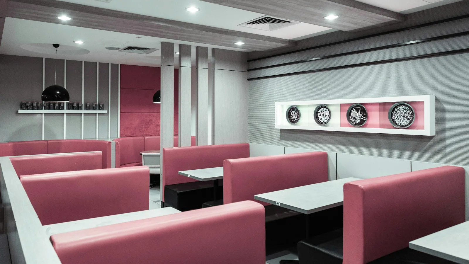
A room with harsh white, cold gray, strong red, and black trim can quickly feel severe, tense, or emotionally cold.
Try this instead
Warm cream + Greige + Clay
A warmer, quieter palette gives the same structure while still feeling more welcoming and more balanced.
Replace the problem by the feeling it is creating
If the room feels too stark
Warm white or oat
This keeps the brightness but removes the hospital-like edge that shows up in cooler, harsher whites.
If the room feels too drained
Greige or mushroom
These colors still read calm, but they hold onto more warmth and depth than cold gray tends to.
If the room feels too intense
Clay, rust, or terracotta
These warmer reds keep the life and warmth but do not hit the nervous system as hard as stronger red can.
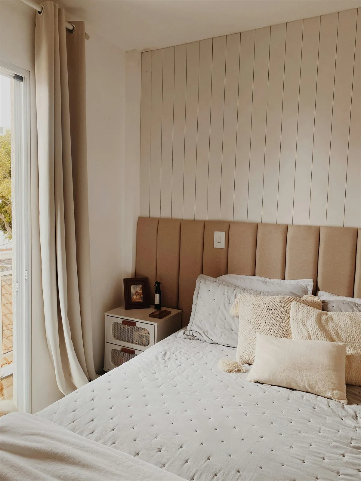
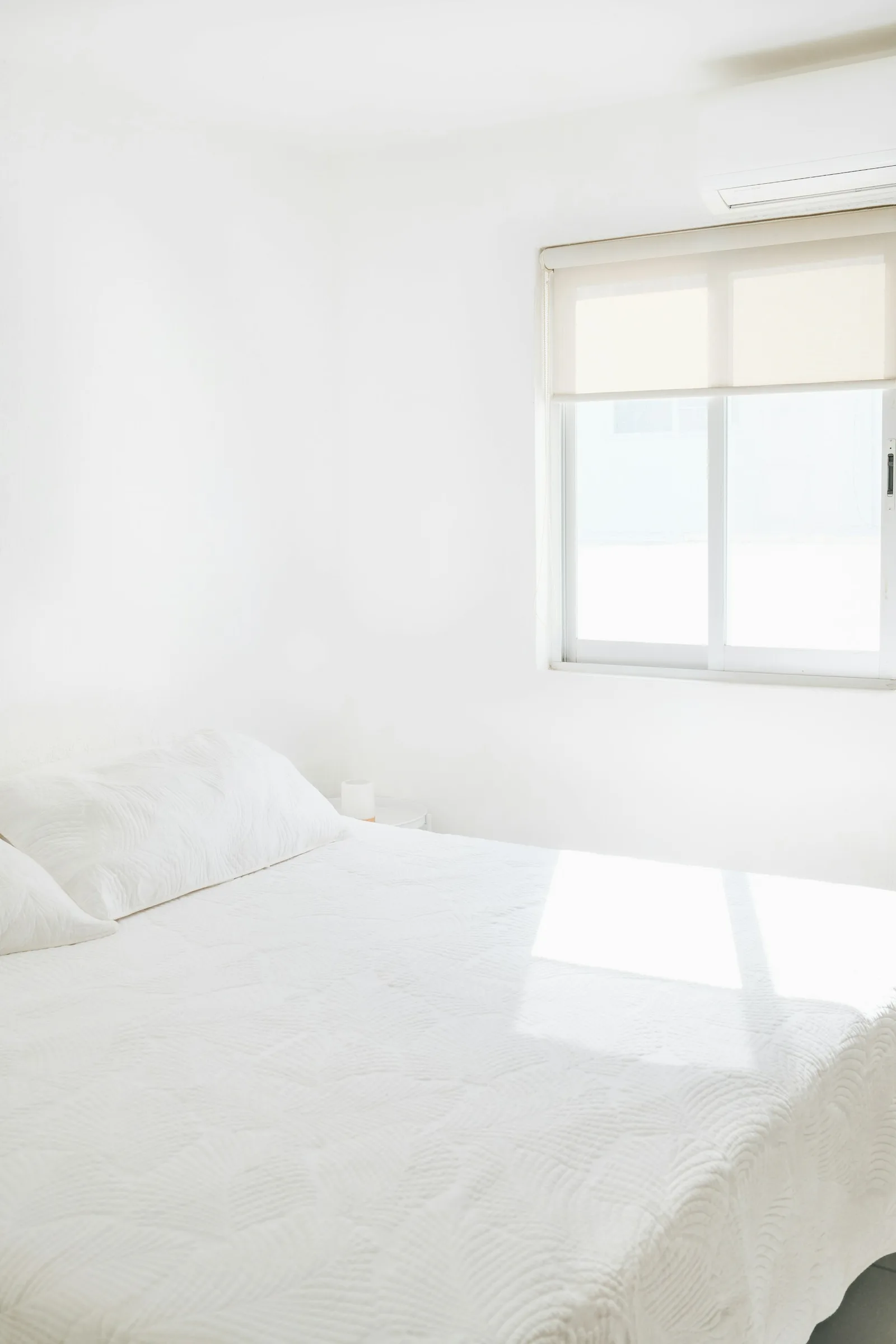
Where These Colors Get Tricky by Room
The same color can behave differently from room to room. A sharp white kitchen may feel crisp in morning light, while the same white in a bedroom can feel exposed at night. A little red can warm a dining corner, but a red bedroom wall can feel too active when the room needs to slow down.
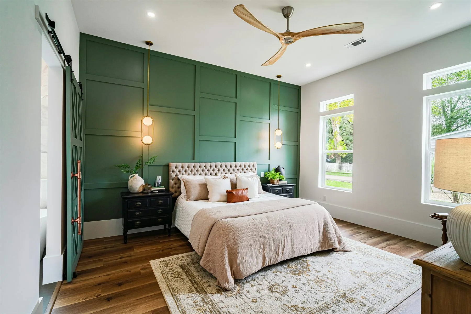
Bedroom
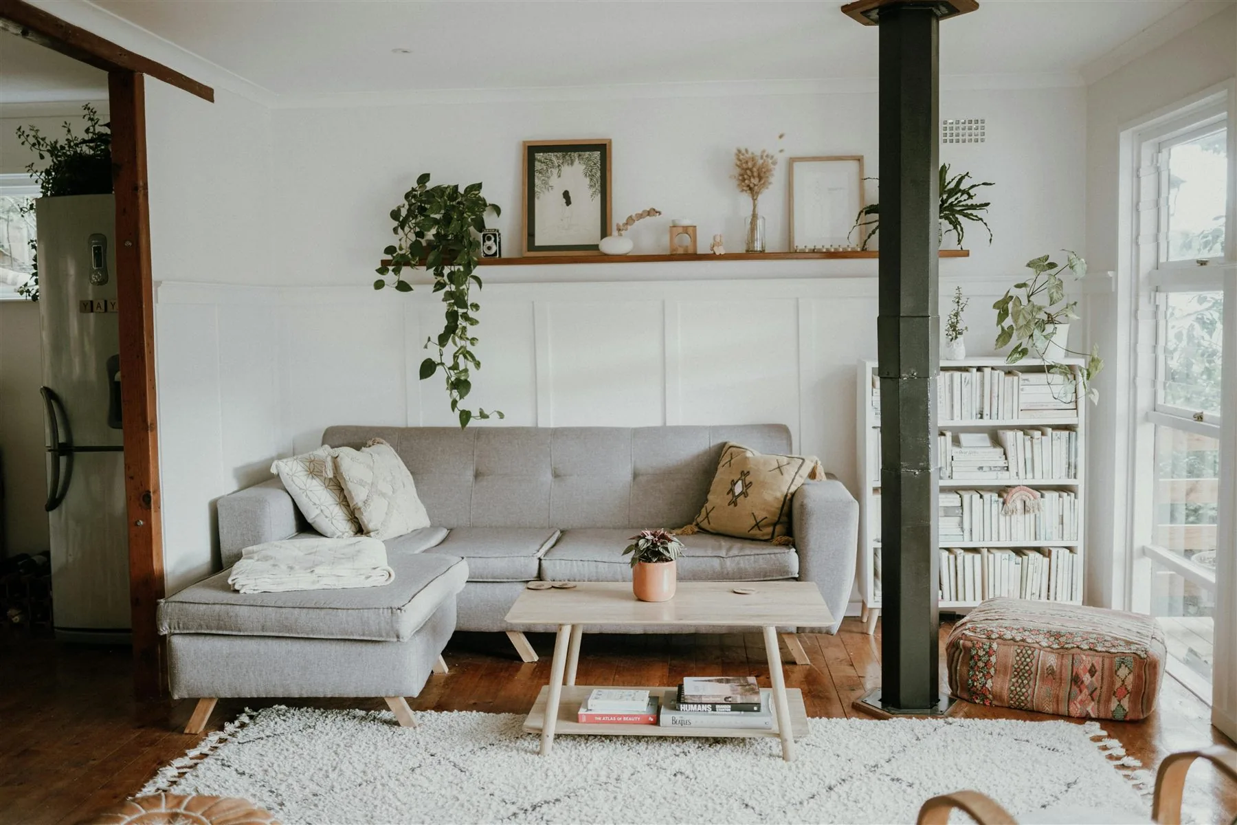
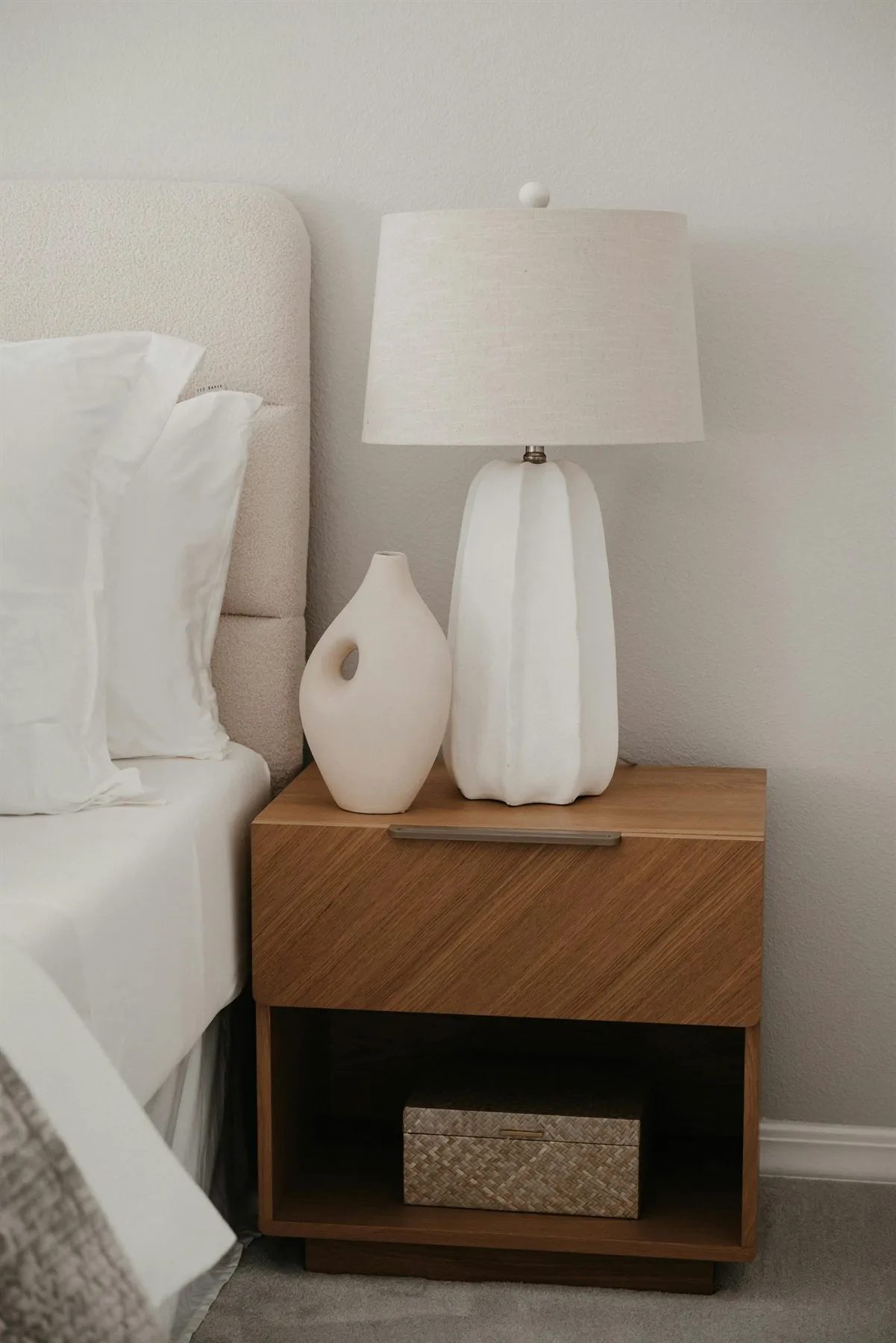
Use carefully: Bright red, icy white, cold gray, and heavy black
Better direction: Cream, oat, blush, muted sage, soft clay, or warm wood tones
Living room
Use carefully: High-contrast black and white, flat gray, or too many loud accents
Better direction: Warm neutrals, wood, olive, sand, muted blue-green, or one grounded accent
Bathroom
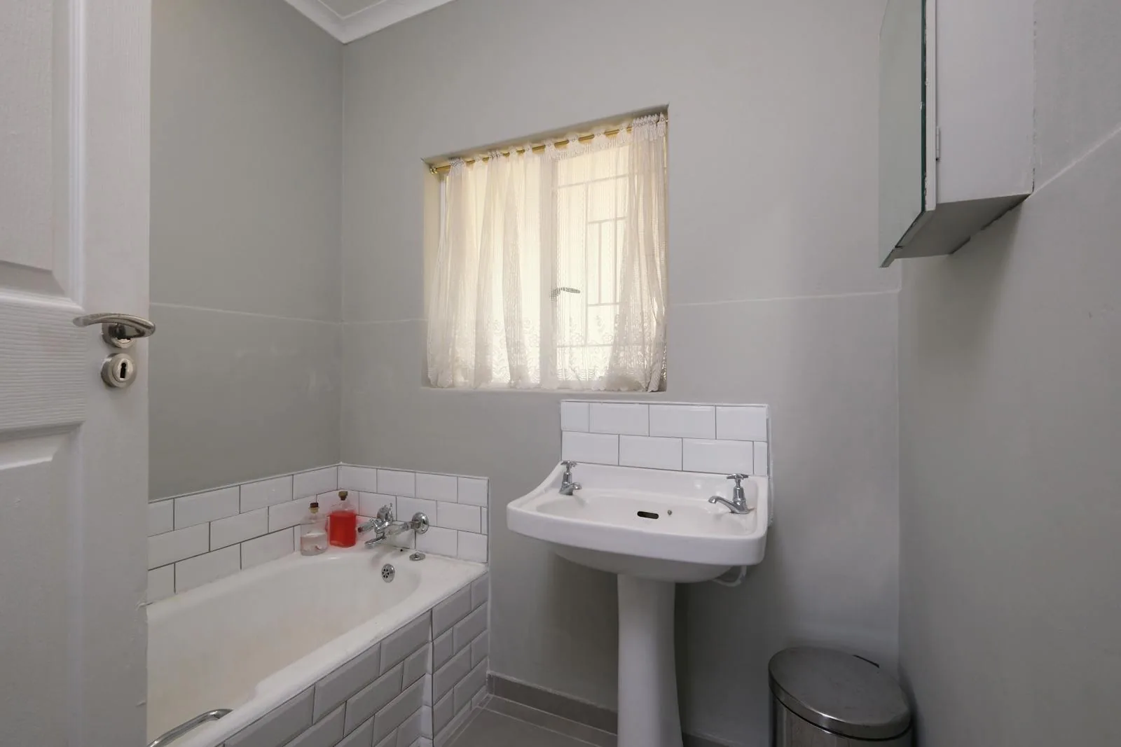
Use carefully: Cold white, blue-gray, and glossy surfaces with no warmth
Better direction: Warm white, stone, sand, soft green, wood accessories, and warmer lighting
Office
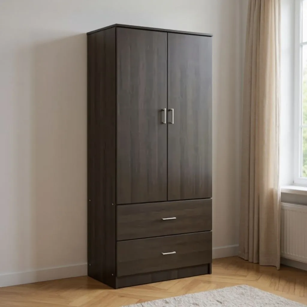
Use carefully: Flat gray, stark white, and dark colors that make the desk feel boxed in
Better direction: Greige, mushroom, warm white, walnut, muted green, or a calm focused backdrop
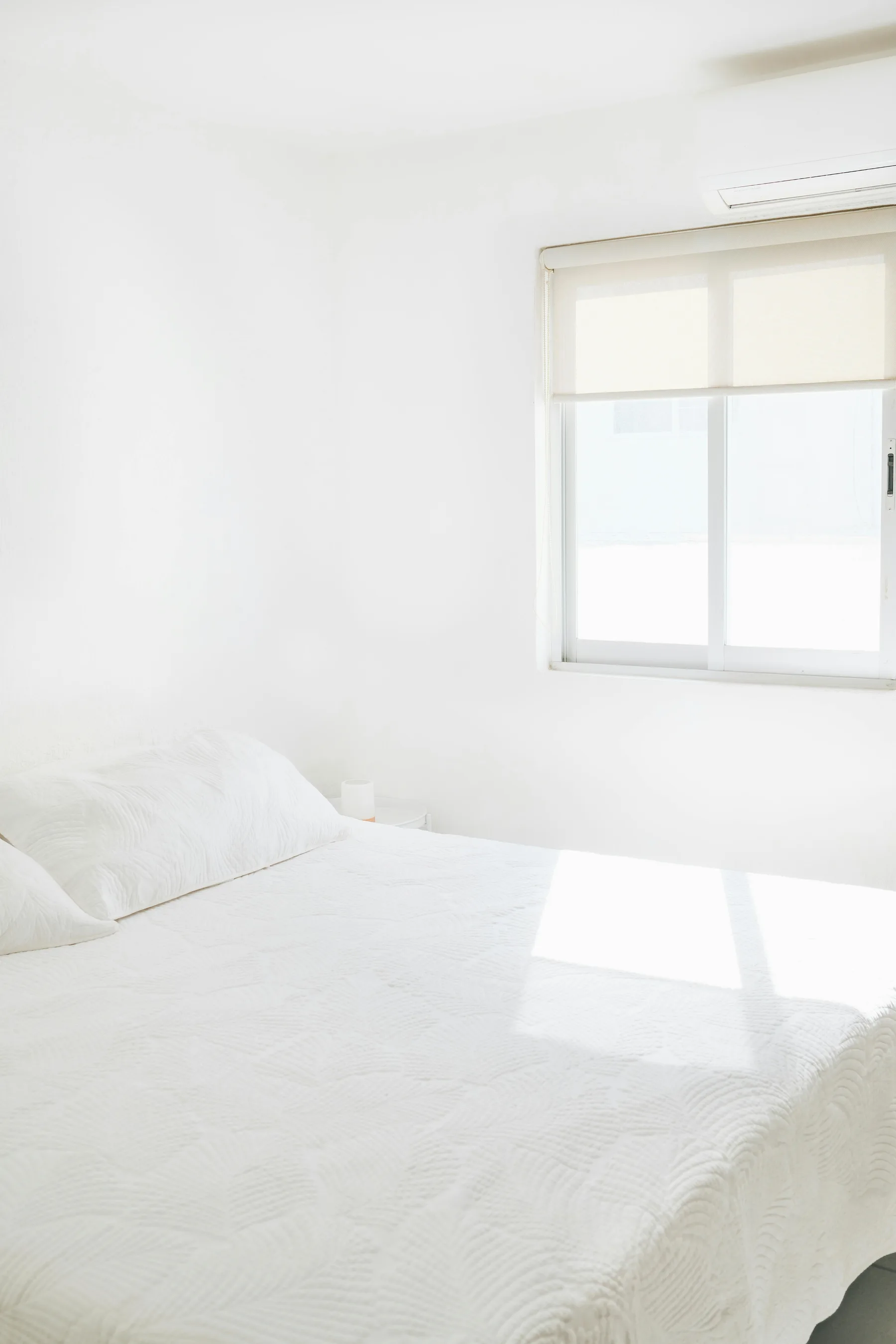
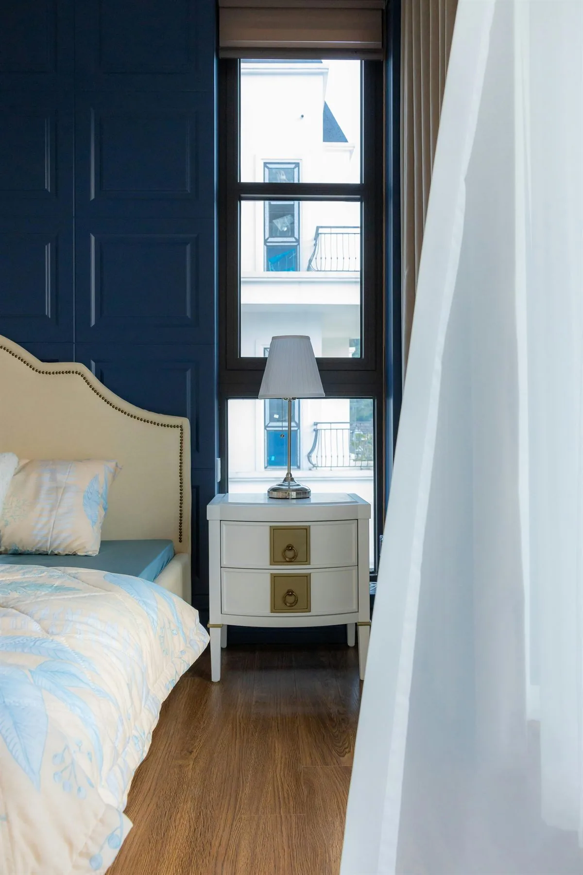
How to Fix a Color You Already Have
You do not always need to repaint. If the furniture, tile, or rental wall color is staying, the fix is to change what the eye reads around it. Light, texture, fabric, wood, art, and plants can pull a difficult color back into balance.
Harsh white walls
Add: Warm bulbs, cream curtains, woven rugs, oat bedding, and wood frames
Why it helps: The room stays bright, but the glare starts to soften.
Cold gray paint
Add: Greige textiles, walnut, warm art, brass, clay, and soft green
Why it helps: The palette gains warmth without fighting the gray completely.
Strong red accents
Add: Sand, cream, natural linen, darker wood, and fewer competing patterns
Why it helps: Red becomes a small spark instead of the whole mood.
Too much black
Add: Warm white, layered lamps, wood, plants, and textured upholstery
Why it helps: The dark color feels grounded instead of closed-in.
How to Tell When the Color Is Actually the Problem
A color is probably the problem when the room still feels off even though the layout, furniture, and clutter are not terrible. If the space feels too sharp, too cold, too sleepy, or too loud, the palette may be exaggerating the issue.
What helps
- +Test whether the room needs softer undertones before chasing a stronger symbolic color.
- +Use the replacement shade in the biggest visual field first, such as walls, a rug, or drapery.
- +Let wood, natural texture, and warm light do some of the balancing work.
- +Adjust the palette by room function, not just by trend.
What makes it worse
- -Assuming a color is lucky just because the symbolism sounds right.
- -Letting one difficult shade dominate the whole room.
- -Using black or red as the main story in a room that already feels dark or intense.
- -Replacing one harsh color with another equally strong option.
Symbolism should not make the room harder to live with
If the color theory sounds good but the room feels worse every evening, the room is giving you the real answer.
If you want the more positive side of this topic, feng shui color palette ideas, feng shui room colors, and feng shui colors for home are the best next reads. If the question is really about money color or abundance color, go to feng shui color that attracts money and colors that attract abundance.
Frequently Asked Questions
What colors should be avoided in feng shui?
Is red always bad in feng shui?
Is black bad in feng shui?
What should I use instead of cold gray?
The Bottom Line
The feng shui colors to avoid are the ones that make the room feel harsher, darker, more restless, or more emotionally flat than it needs to. That is why harsh white, cold gray, aggressive red, and heavy black are the easiest colors to overdo.
The better replacement is softer, warmer, or more grounded. If the room feels easier to live in after the change, that matters more than the color label by itself.