



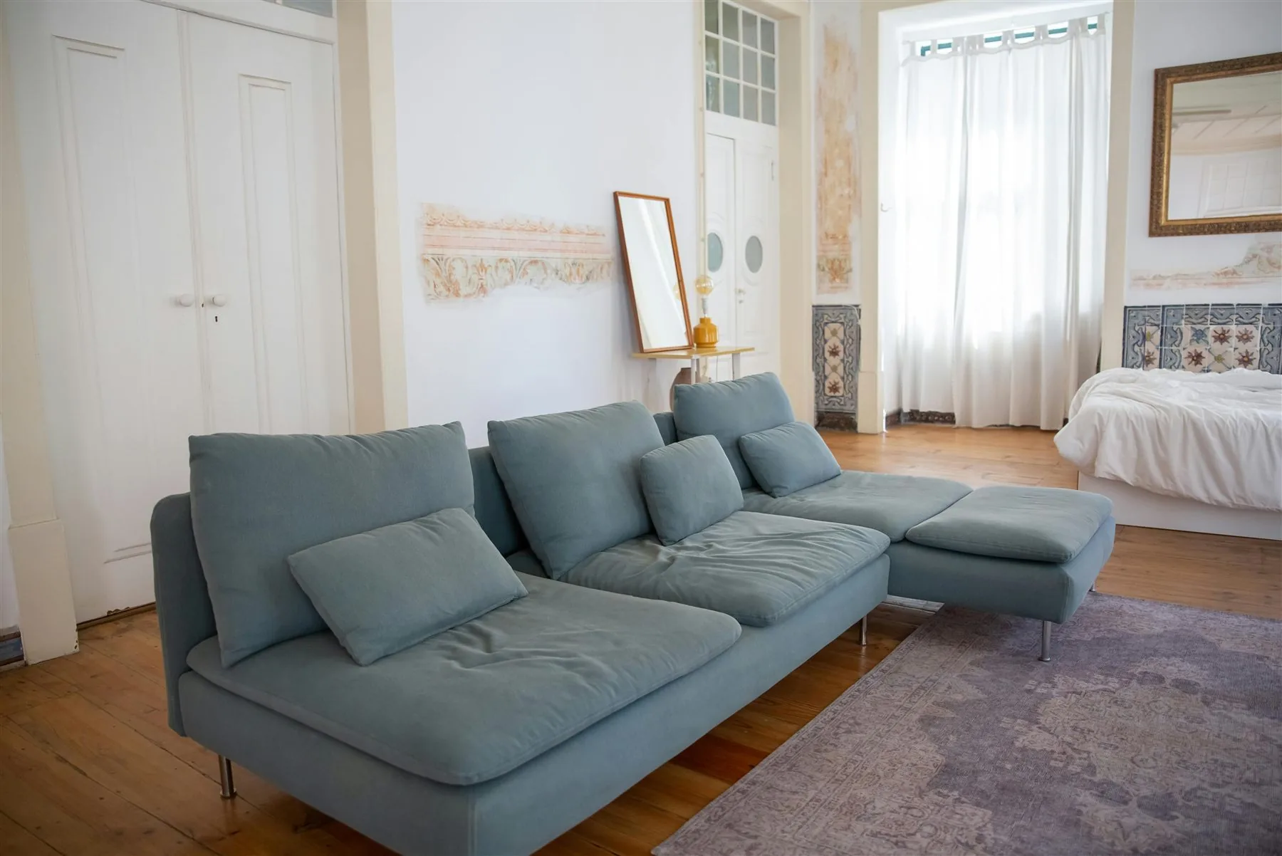
Quick Answer
The best feng shui color palette ideas follow a simple pattern: one calm base color, one grounding support tone, and one warmer or deeper accent. That is what keeps a room balanced instead of flat, cold, or visually noisy.
It is easy to focus too much on single paint colors. A room feels better because the whole palette works together, not because one color happened to be symbolic.
In feng shui, a good palette should support the function of the room and the feeling you want there. The easiest palettes to live with are softer, more grounded, and a little warmer than trend-driven combinations that only look good in a photo. If your main question is wellness, feng shui color for health narrows the palette logic down to the colors that feel most restorative.
How to Think About a Feng Shui Palette
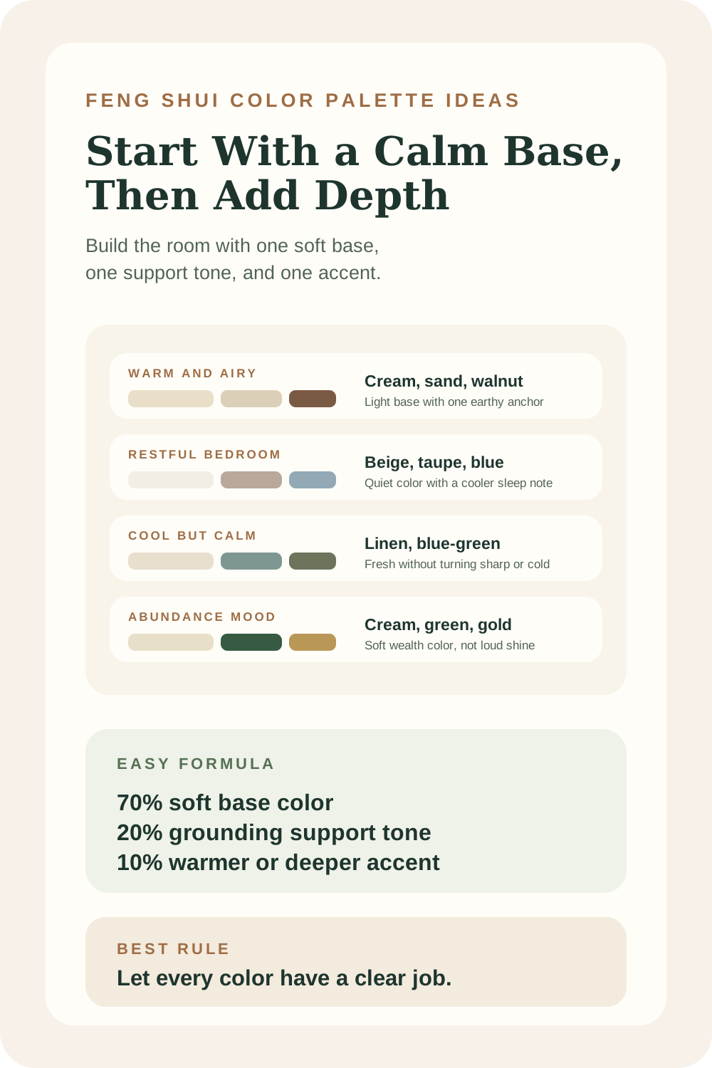
The palette formula that works best
70% base
A calmer main tone
Use the softest color on the largest surfaces so the room feels open and coherent.
20% support
A grounding secondary color
Let the room get depth through furniture, drapery, cabinetry, or a more anchored zone.
10% accent
A warmer or richer note
Keep stronger color in edited accents so the room gets life without losing calm.
Five Palette Ideas That Work Well
Five palettes for different moods
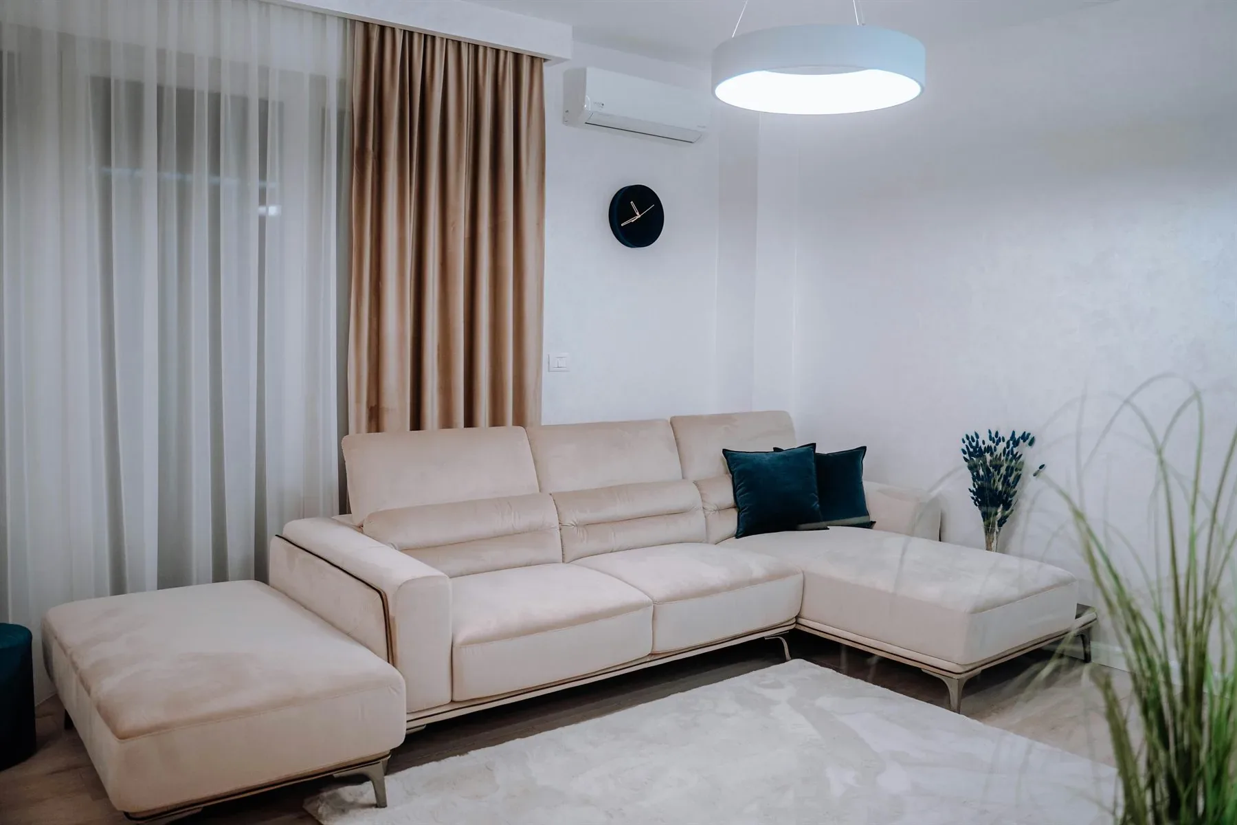
Warm and airy
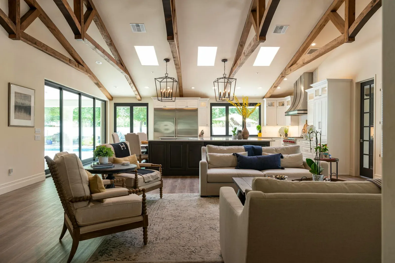
Warm cream + Sand + Walnut
Good for living spaces, entryways, and brighter rooms that need softness more than drama.
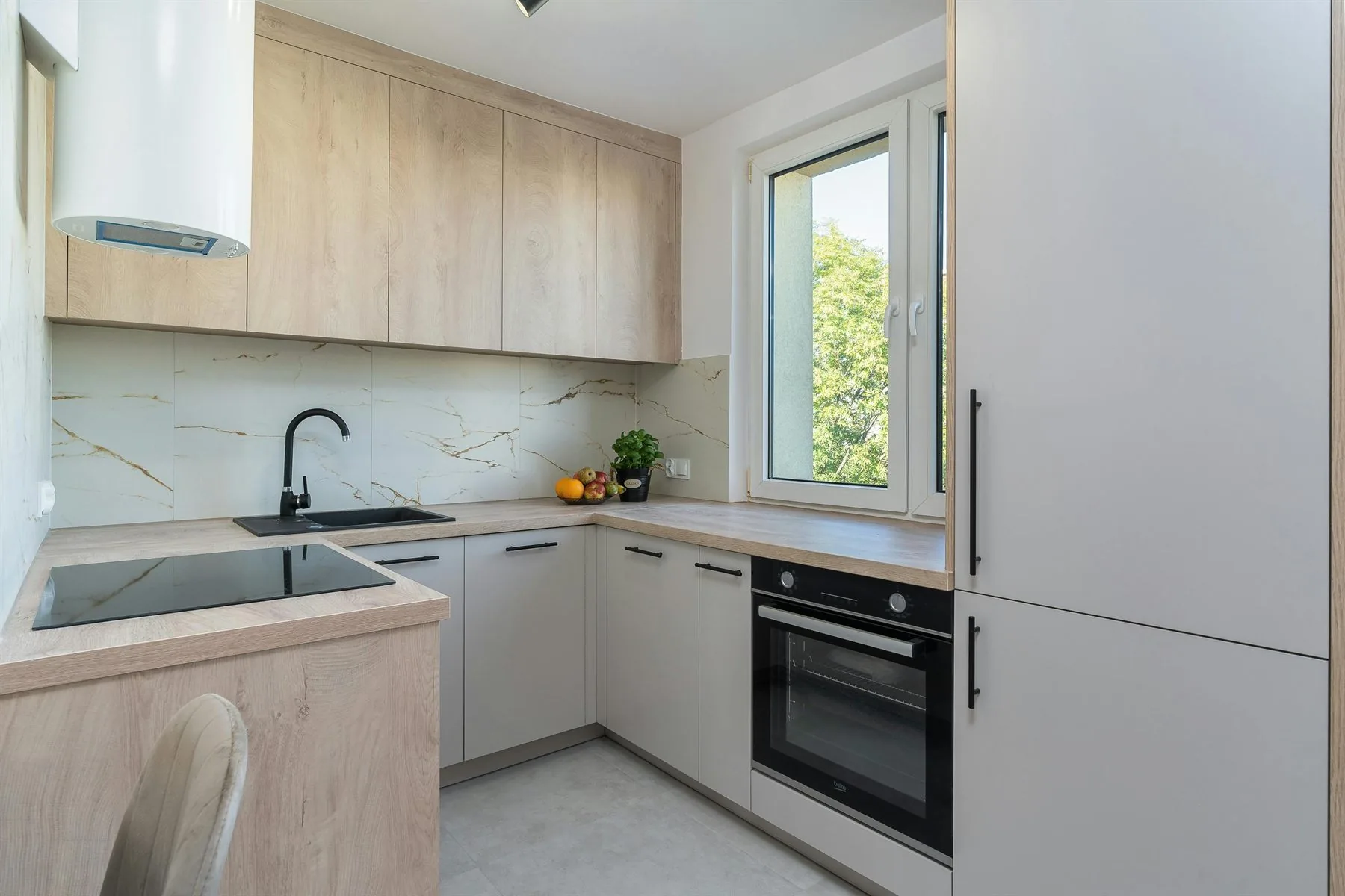
Grounded green
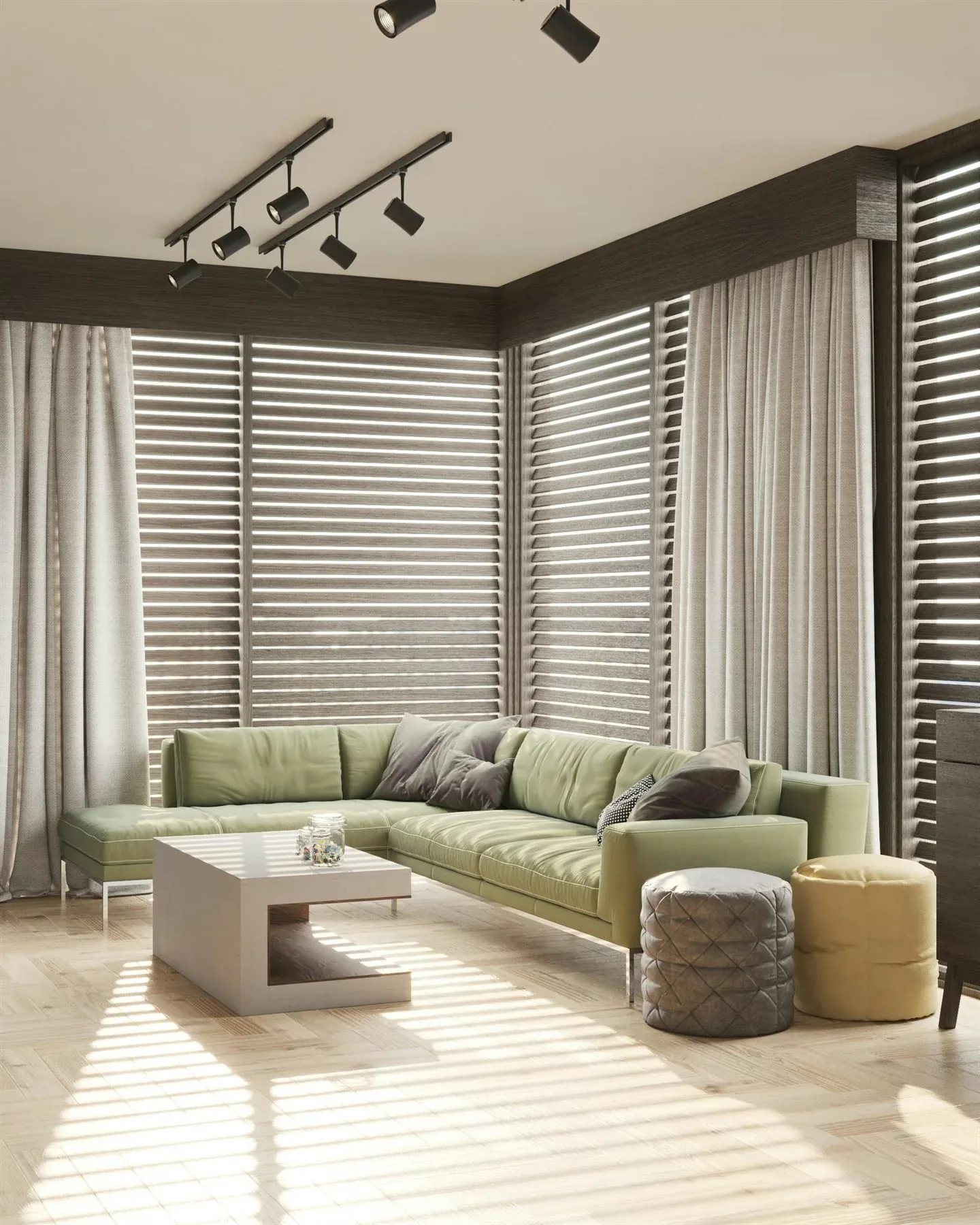
Sage + Linen + Clay
Helpful for living rooms, kitchens, or offices that need more life without more noise.
Cool but calm
Dusty blue-green + Greige + Moss
A better fit for very bright rooms that need relief without tipping into cold gray.
Restful bedroom
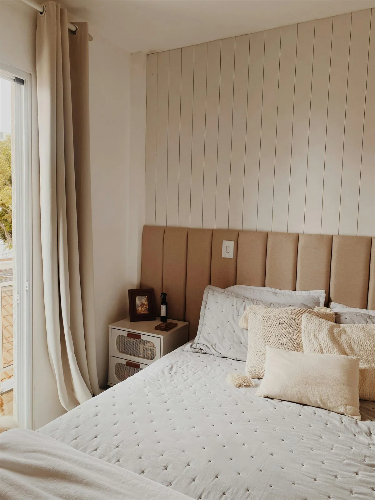
Warm beige + Taupe + Dusty blue
One of the easiest palette families for bedrooms that should feel quiet and sleep-friendly.
Abundance mood
Forest green + Cream + Soft gold
Useful when you want a richer room that still feels believable and easy to live with.
Use the Five Elements as Palette Families
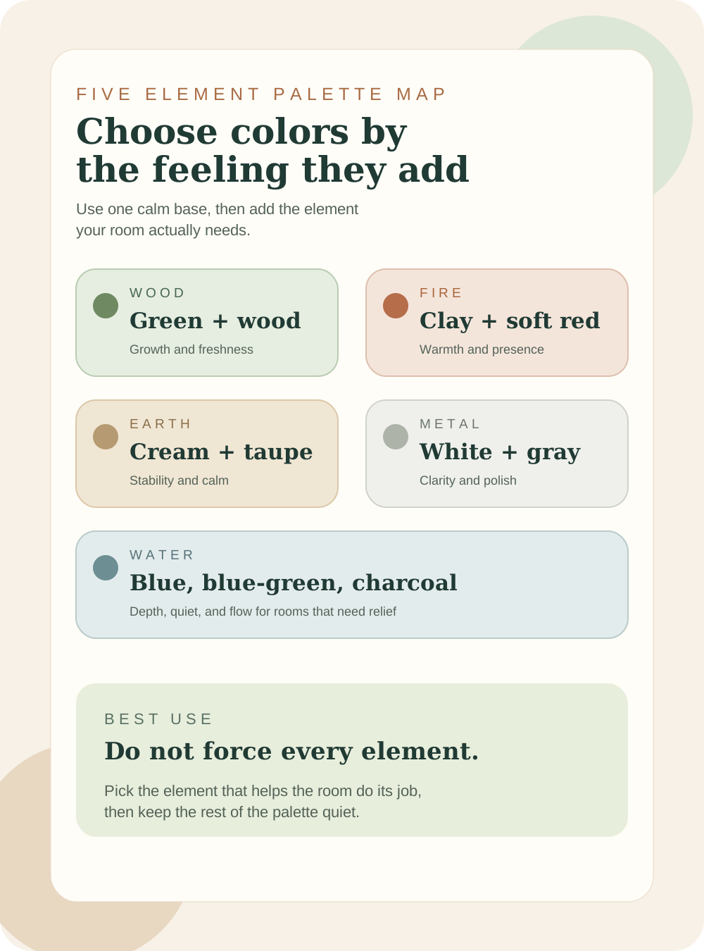
The five elements are useful when they help you understand what a room is missing. Wood colors add growth. Fire colors add warmth. Earth colors settle the room. Metal colors clean up the look. Water colors add depth and quiet. You do not need every element in every room; you need the one that supports the room's job.
Give each palette color one job
Best base color
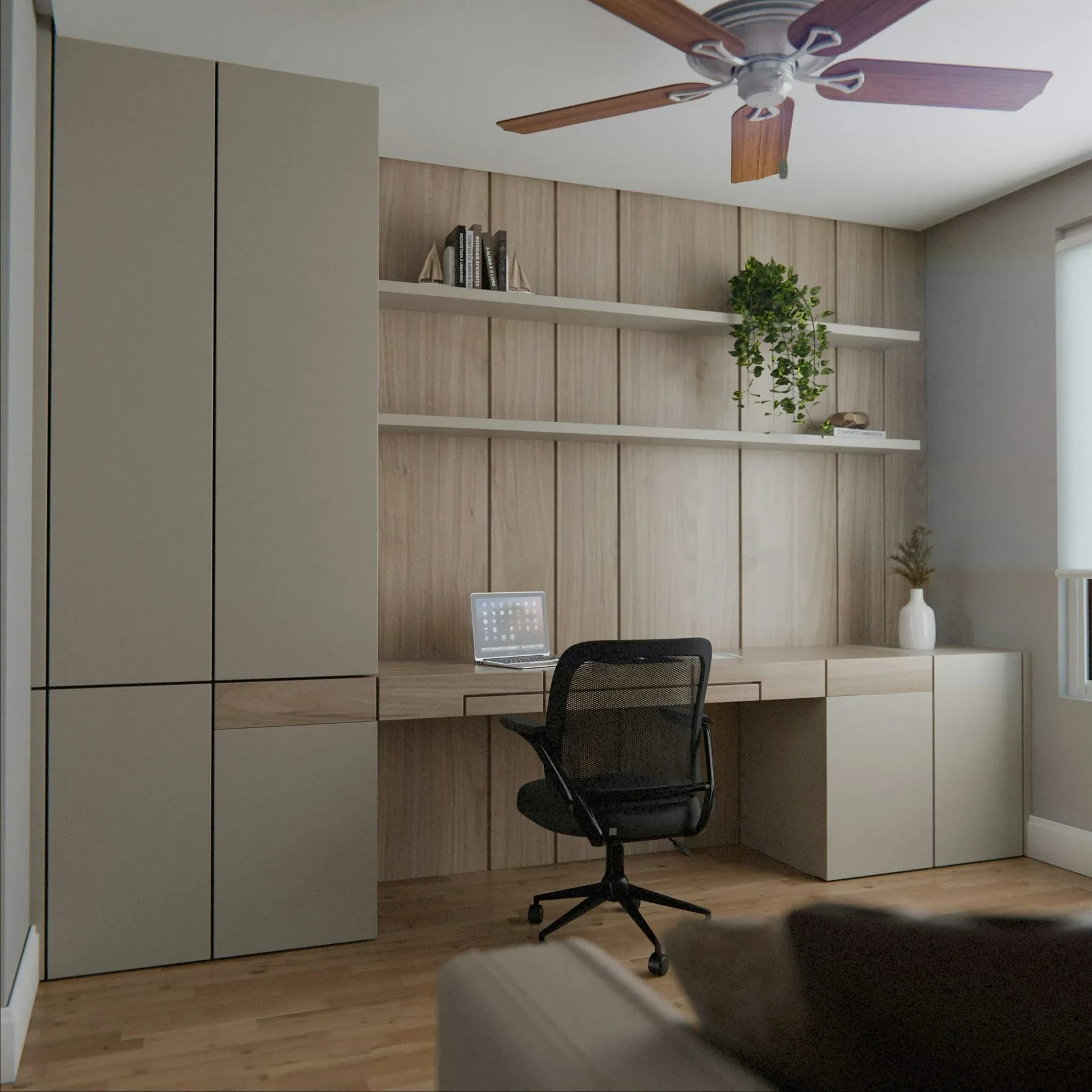
Warm cream, greige, or soft beige
The base should make the room feel open enough to hold everything else without turning cold or stark.
Best support color
Sage, taupe, mushroom, or blue-green
The support color gives the room its grounded mood through furniture, cabinetry, or a more anchored surface.
Best accent color
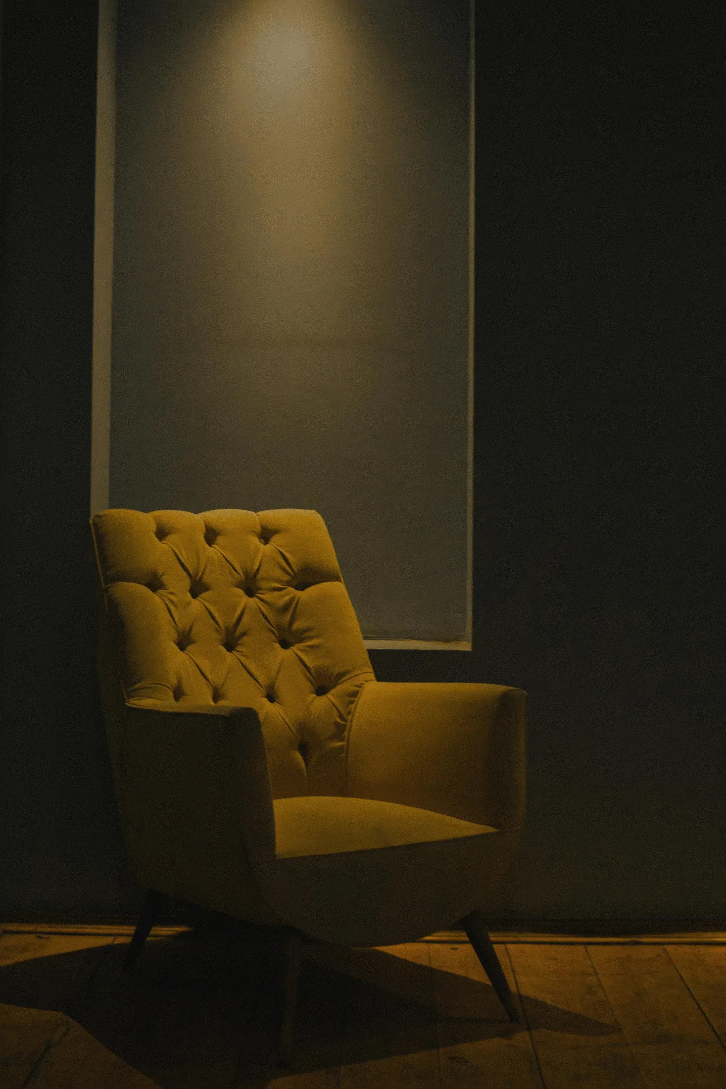
Clay, brass, forest green, or walnut
The accent should give the room warmth, richness, or depth in smaller touches, not take over every surface.
How to Use Palette Ideas Without Making Rooms Repetitive
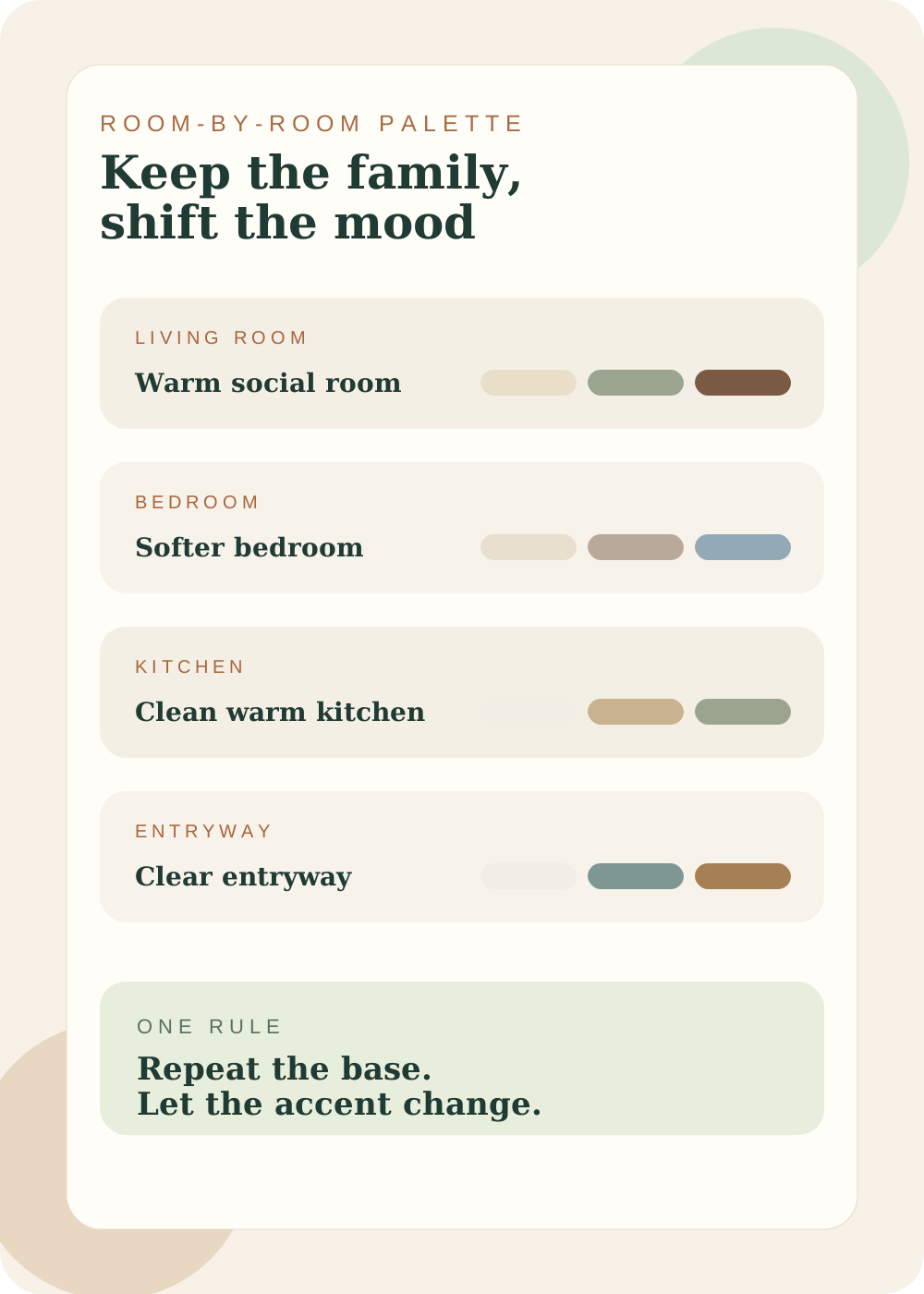
The trick is not making every room identical. It is keeping the house in the same color family while letting each room shift a little depending on how it should feel. Living rooms often want warmth and connection. Bedrooms want softness and less stimulation. Entryways want brightness and a clearer first impression.
The palette mistake that happens most
Avoid this
Hot pink + Cold gray + Sharp yellow
Too many unrelated statement colors often make the room feel emotionally scattered, even when each color looked good by itself.
Try this instead
Warm cream + Sage + Clay
A room feels steadier when the undertones relate to each other and only one color carries the stronger accent role.
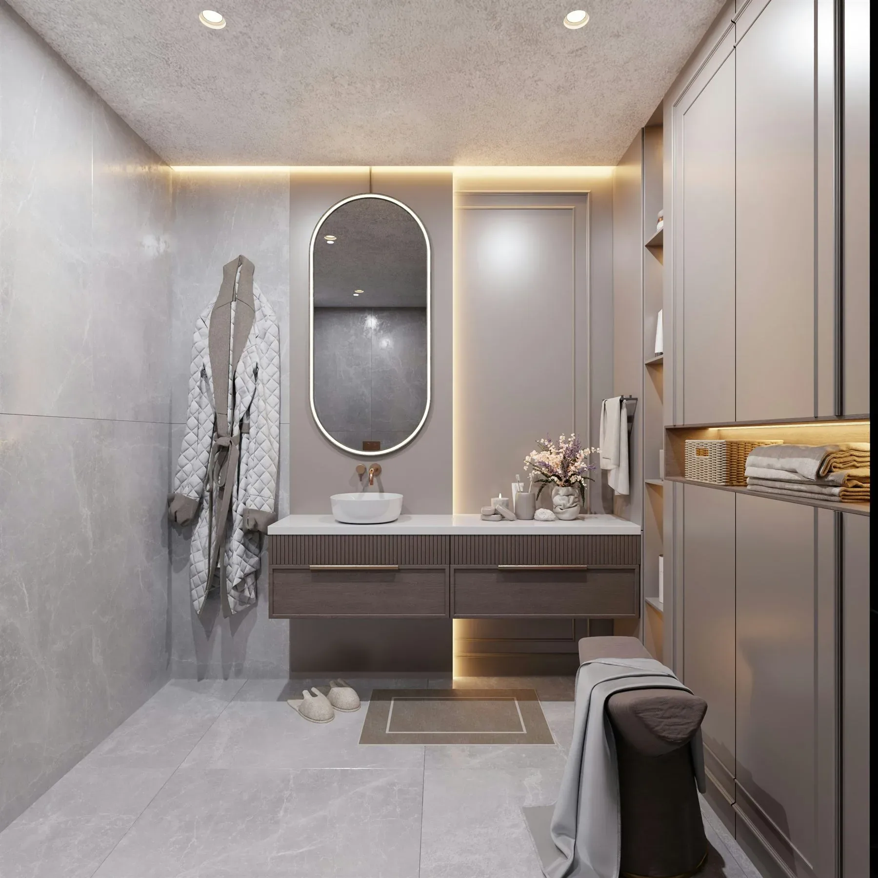
If you want to go deeper into specific rooms, the best follow-up guides are feng shui colors for living room, feng shui colors for bedroom, feng shui colors for kitchen, feng shui colors for bathroom, feng shui colors for office, and colors that attract abundance.
Frequently Asked Questions
What is the best feng shui color palette?
How many colors should be in a feng shui palette?
Should every room have the same feng shui palette?
What weakens a feng shui color palette?
The Bottom Line
The best feng shui color palette ideas are simple, calm, and believable in a real room. Start with one softer base, add one grounding support tone, and let the accent stay in a smaller role.
Rooms feel stronger when the colors relate to each other and to the function of the space. That is what makes the palette feel balanced instead of just decorative.