



Quick Answer
A feng shui color chart is most useful when it tells you what a color family tends to feel like, where it works best, and how much of it a room can realistically handle. The room should always matter more than the symbol alone.
Most color confusion comes from treating symbolic meaning like a paint instruction. A better color chart connects each color to mood, scale, and room use.
That is why the best feng shui color chart is not only about elements. It is also about whether a color works as a wall field, a furniture tone, or just a smaller accent.
Use this page as the reference layer: it explains color meanings, element relationships, and practical dosage. If you already know which space you are decorating, use the room-color selector and then open the relevant room guide. If you are coordinating several rooms, the whole-home color guide owns that decision. The colors-to-avoid guide covers difficult dominant colors and better alternatives rather than changing the meanings in this chart.
How to Read a Feng Shui Color Chart
The best way to read the chart is to ask three questions. What should the room feel like? How large should the color's role be? And does the room's light make that color softer or harsher?
The easiest way to apply a color chart
60% base
Cream, greige, or warm white
Best for larger wall fields and rooms that need the eye to relax.
30% support
Sage, mushroom, or blue-green
Works well through furniture, cabinetry, drapery, or a more grounded room zone.
10% accent
Clay, gold, or darker wood
Better in edited doses so the room gets life without becoming visually loud.
Five Element Feng Shui Color Chart
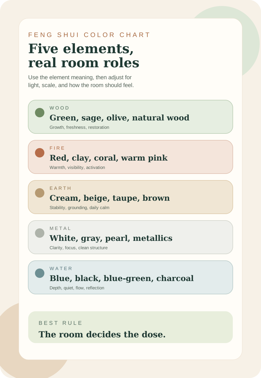
Most feng shui color charts begin with the five elements. Wood colors add growth, Fire colors add warmth, Earth colors add steadiness, Metal colors add clarity, and Water colors add depth. The useful move is not forcing every element into a room. It is choosing the color family that helps the room do its job.

A Practical Feng Shui Color Chart
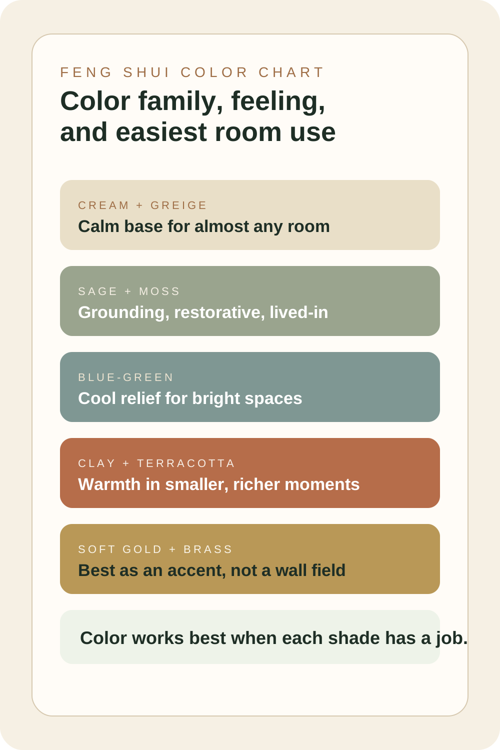
Color chart by feeling and easiest use
Think of this as a room-use chart rather than a rigid symbolism chart.
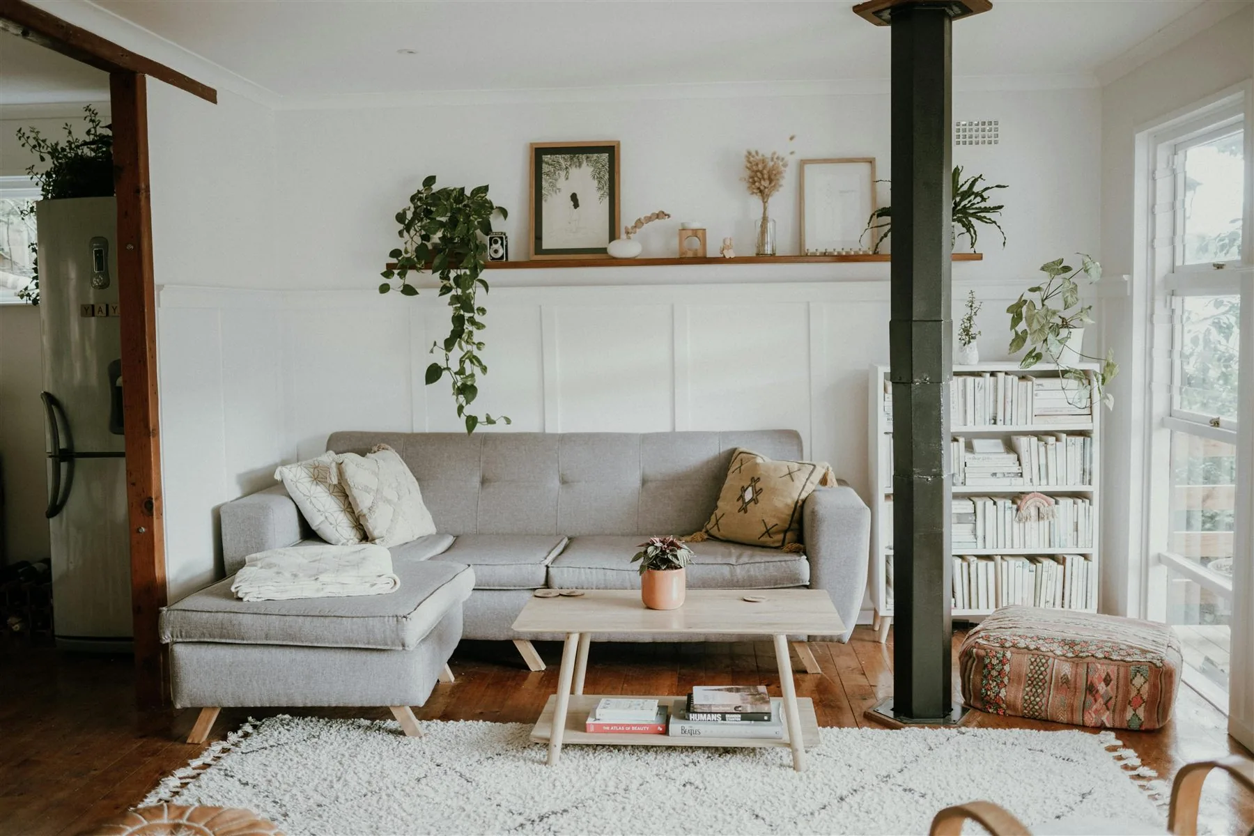
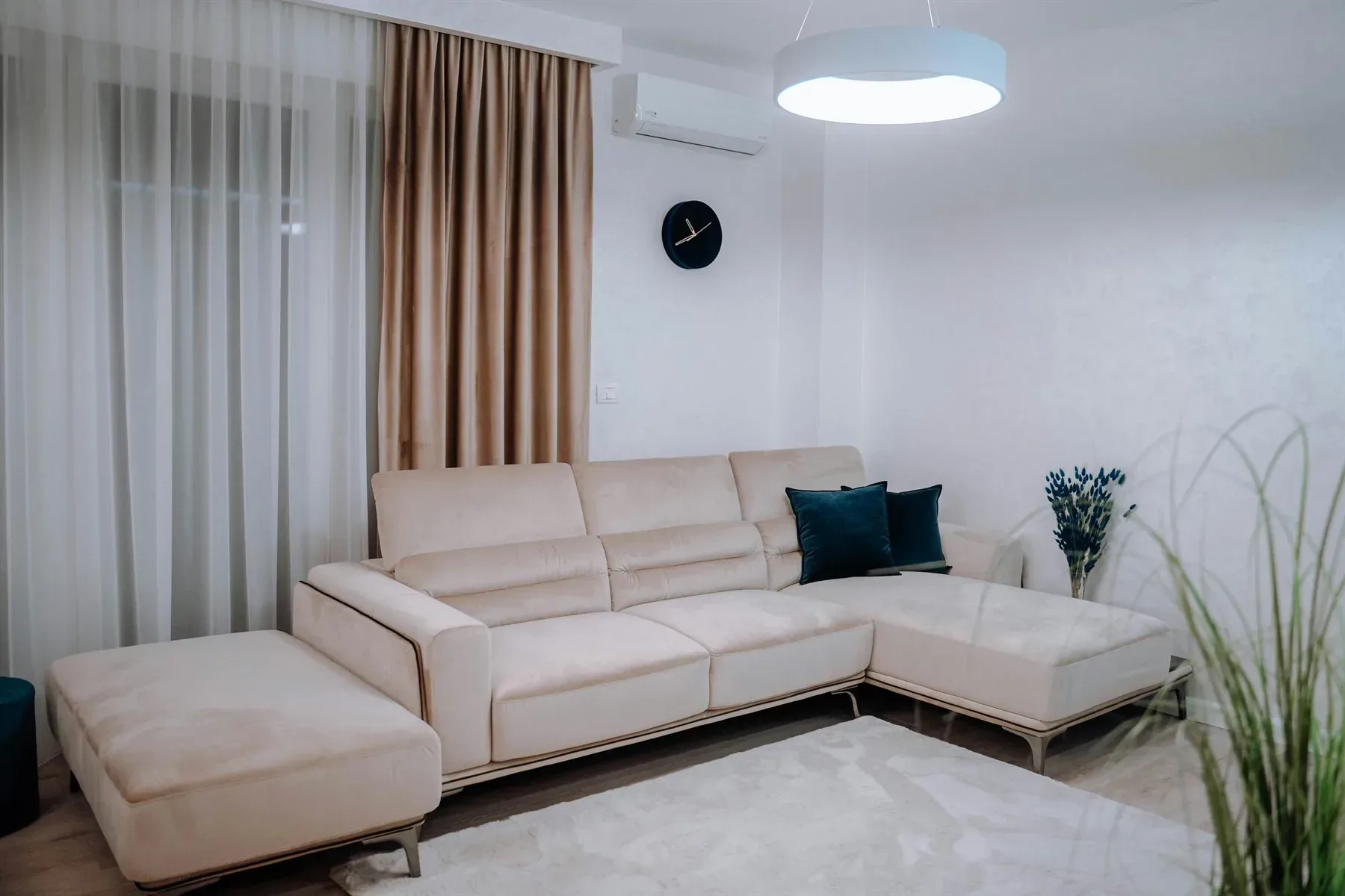
Warm cream and greige
Calm base
Warm cream and greige + Oat + Walnut
Best for walls, larger rugs, bedrooms, living rooms, and any space that needs softness more than contrast.
Sage and moss
Grounded and restorative
Sage and moss + Cream + Clay
Useful for living rooms, bedrooms, offices, and rooms that need a little more life without more noise.
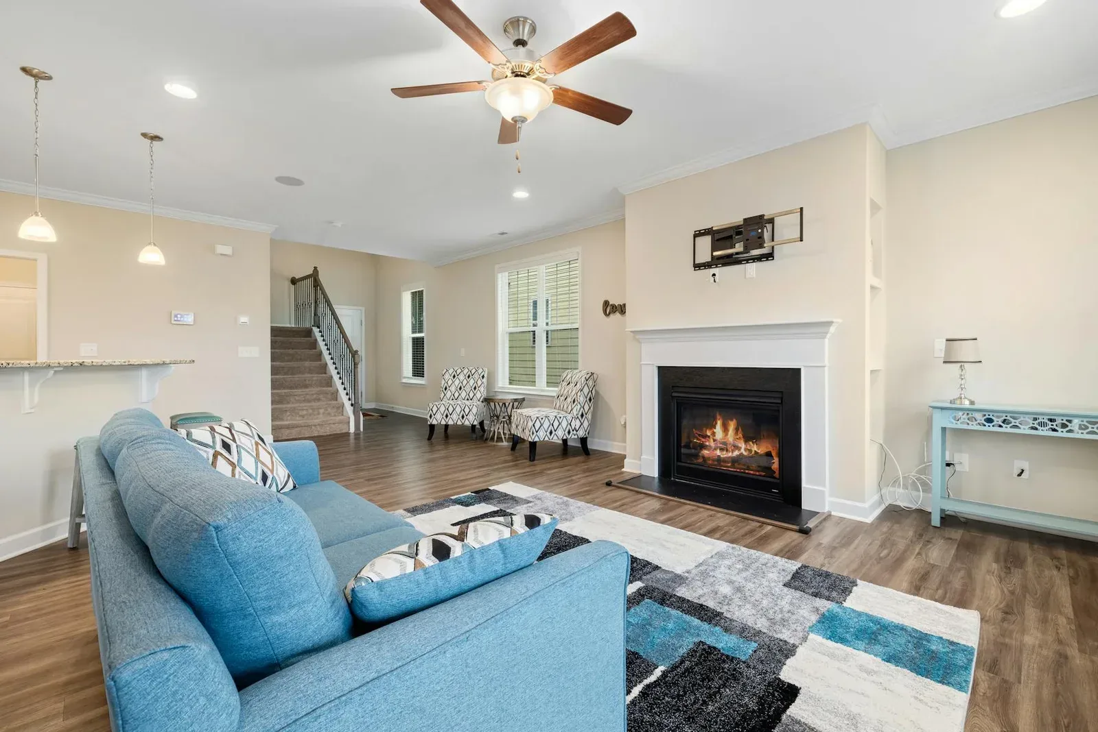
Dusty blue-green
Cool relief
Dusty blue-green + Greige + Moss
Helpful in brighter rooms that need visual cooling, especially when warmer wood still balances the room.
Clay and terracotta
Warmth and invitation
Clay and terracotta + Cream + Brass
Best in smaller accents, textiles, art, pottery, or one richer furniture moment rather than every wall.
Soft gold and brass
Lift and value
Soft gold and brass + Warm white + Walnut
Best as an accent through lighting, frames, hardware, or one polished detail rather than a main color field.
Warm cream / greige
Effect: Calms the visual field
Best use: Almost any room that needs a softer base
Sage / moss
Effect: Adds grounded life
Best use: Living rooms, bedrooms, offices, or calmer kitchen accents
Dusty blue-green
Effect: Creates cooler relief
Best use: Brighter rooms, offices, and some bedrooms
Clay / terracotta
Effect: Builds warmth and invitation
Best use: Accent textiles, pottery, art, or one richer piece
Soft gold / brass
Effect: Adds lift and value
Best use: Lighting, hardware, frames, and smaller details
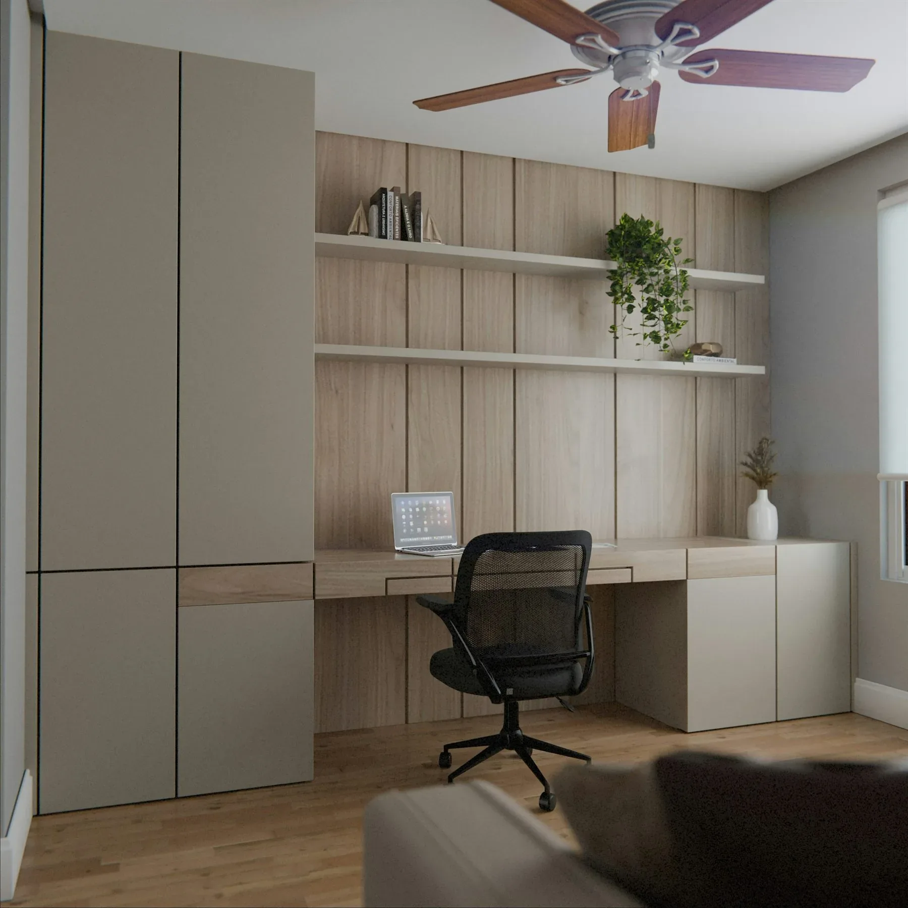
How to Use the Chart Without Making the Room Flat
Use the chart by role, not by obsession
Best main wall color
Warm cream, greige, or soft beige
These tones give the room enough softness to hold the rest of the palette without becoming harsh.
Best support color
Sage, moss, or blue-green
Support colors often work better through furniture or a grounded zone than across every surface.
Best accent color
Clay, brass, or walnut
These stronger notes work best when they stay edited and give the room a little warmth or polish.
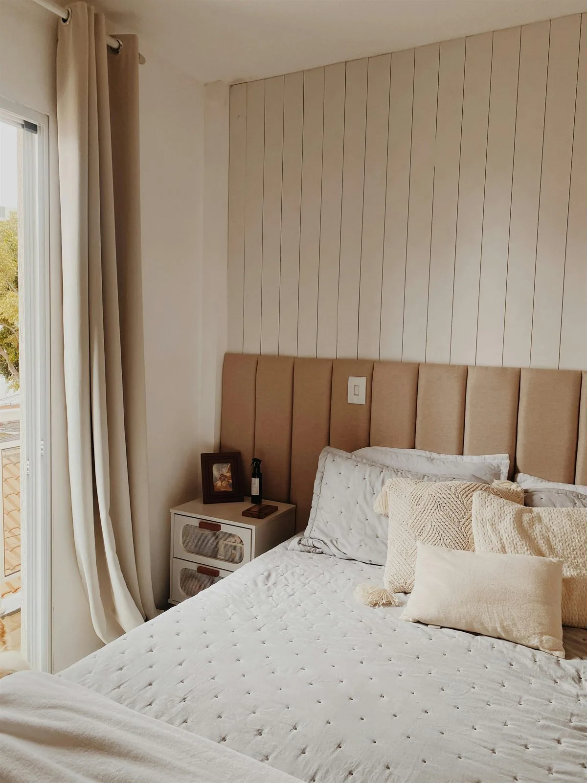
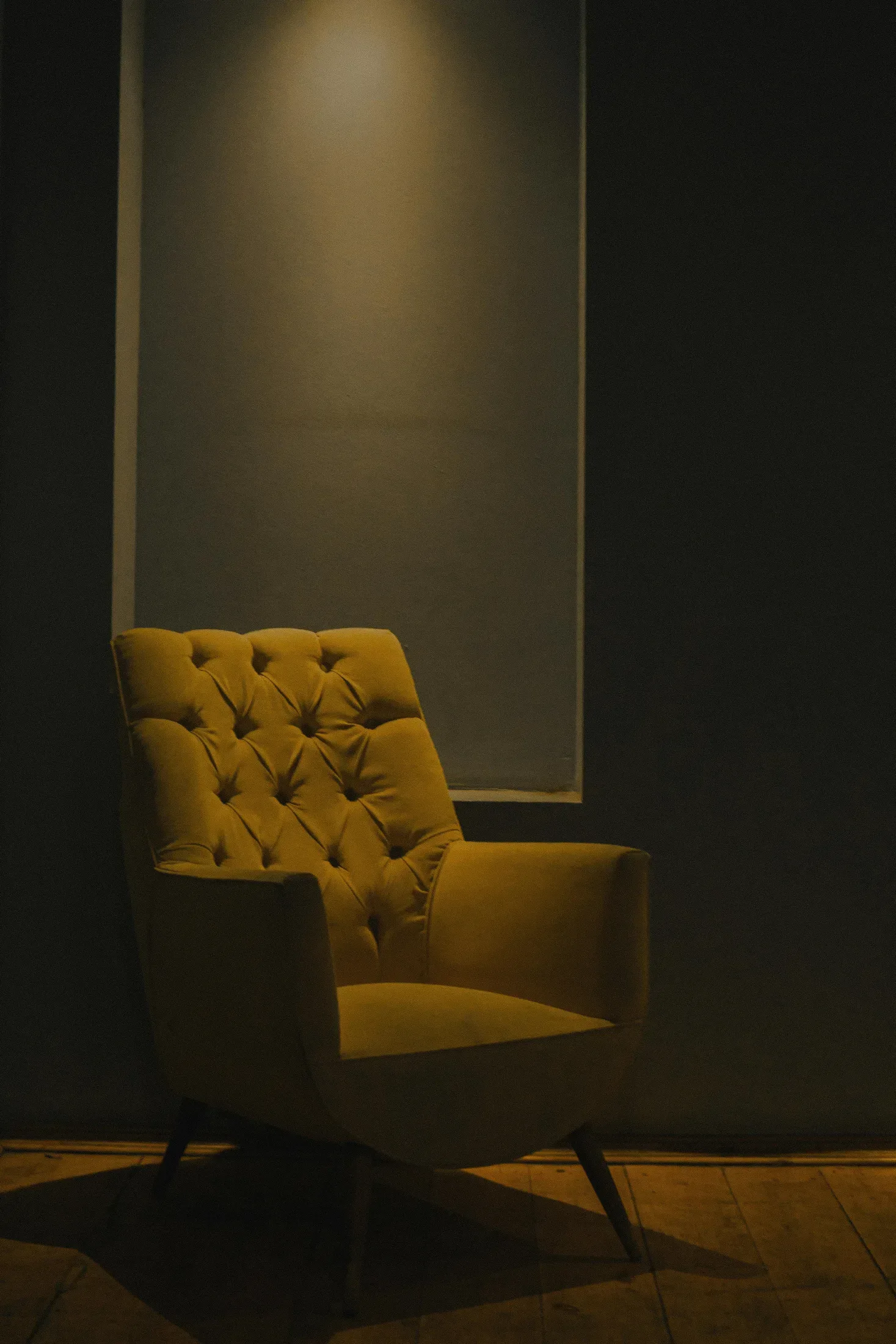
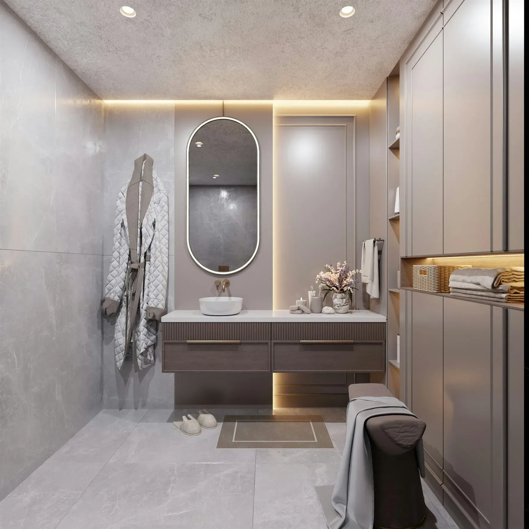
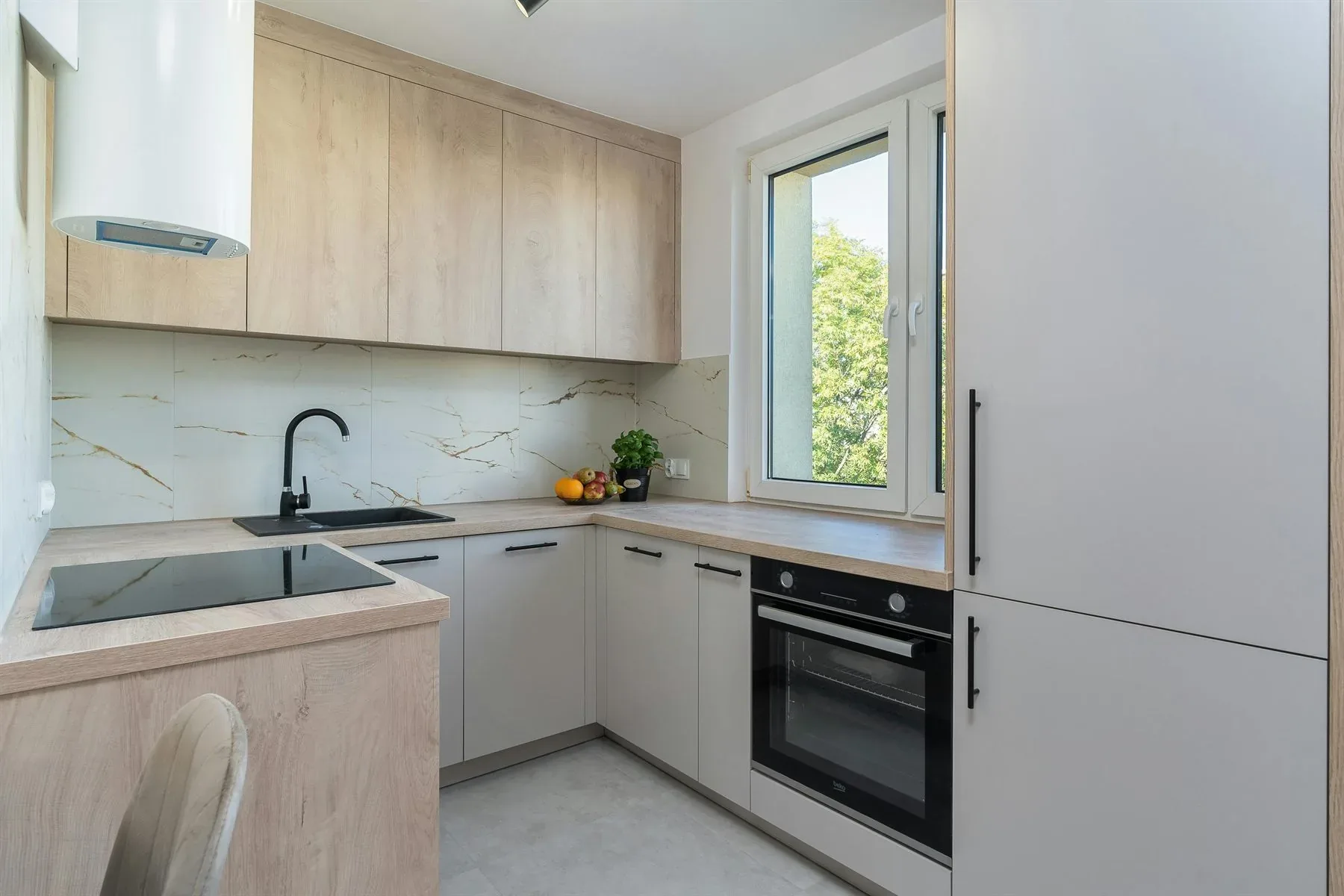
If you want room-specific uses after the chart, the best next reads are feng shui colors for bedroom, feng shui colors for living room, feng shui colors for home, and feng shui color palette ideas.
Most common chart mistake
A color chart becomes less useful when it makes you choose colors only by symbolism and ignore the room's light, size, and emotional goal.
To understand the relationships behind these associations rather than simply look up a color, read the five feng shui elements.
Frequently Asked Questions
What is a feng shui color chart for?
Which feng shui colors are easiest to use?
Should I use the chart literally?
What is the most common color mistake in feng shui?
The Bottom Line
A good feng shui color chart should help you understand what a color family does in a room, not just what it means in theory. The most useful colors are the ones that support the room's real mood and function.
Use the chart as a guide for role and dosage. That is what keeps color supportive instead of overwhelming.