



Quick Answer
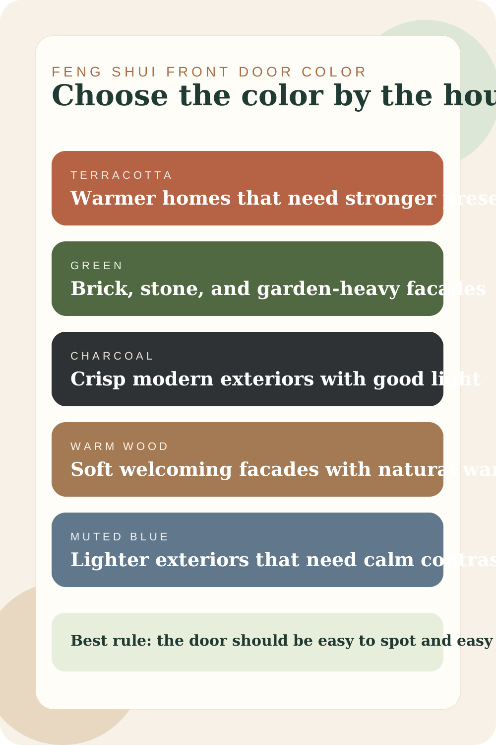
The best feng shui front door color is the one that suits the facade and makes the entry easier to notice. Terracotta, green, charcoal, warm wood, and muted blue are some of the easiest directions, but the house around the door still decides which one feels right.
Choosing a color for an eastern entrance? Our east-facing house guide explains how to use green and timber without treating the direction as a reason to replace finishes that already work.
A front door color should strengthen the entry, not compete with the whole house. That is why the same color can look perfect on one home and completely wrong on another.
The real job of the color is simple. It should make the door feel intentional, visible, and welcoming from the approach. If it does that, the feng shui is already moving in the right direction.
How to Pick a Front Door Color That Actually Works
Start by standing back from the house. Is the facade warm or cool? Light or dark? Garden-heavy or very architectural? The color needs to belong to that picture first.
Scroll sideways to compare all columns.
| What to check first | Why it matters | Best color effect |
|---|---|---|
| Facade warmth | Warm brick, stone, and cream need different color partners than icy gray siding. | Pick a color with undertones the house can carry naturally. |
| Street visibility | The door should read as a destination, not disappear from the approach. | Use enough contrast to make the entry easy to find. |
| Architecture style | Minimal homes and traditional homes carry color differently. | Match the color intensity to the architecture. |
| Landscaping | Plants, brick, and stone can make some door colors look richer or duller. | Use the garden and exterior materials as color partners. |
The Front Door Colors That Work Best
The easiest front door color directions
Each one works best in a different kind of facade context.
Terracotta and earthy red
Inviting and grounded
Terracotta and earthy red + Cream + Clay
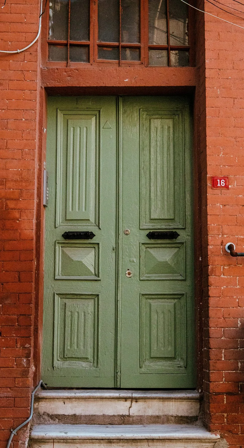
Best when the house needs a stronger focal point and already carries warmth through brick, stucco, cream paint, or stone.
Deep green
Natural and steady
Deep green + Brick + Stone
Strong for brick facades, garden-heavy exteriors, and homes that need a calmer richer color instead of brighter contrast.
Charcoal
Crisp and substantial
Charcoal + Warm white + Walnut
Works well on cleaner modern homes where the architecture already feels strong and the entry gets enough light.
Warm wood and tan
Soft and welcoming
Warm wood and tan + Sand + Olive
Best when the home needs less paint drama and more natural warmth across the threshold.
Muted blue
Calm contrast
Muted blue + Greige + Cream
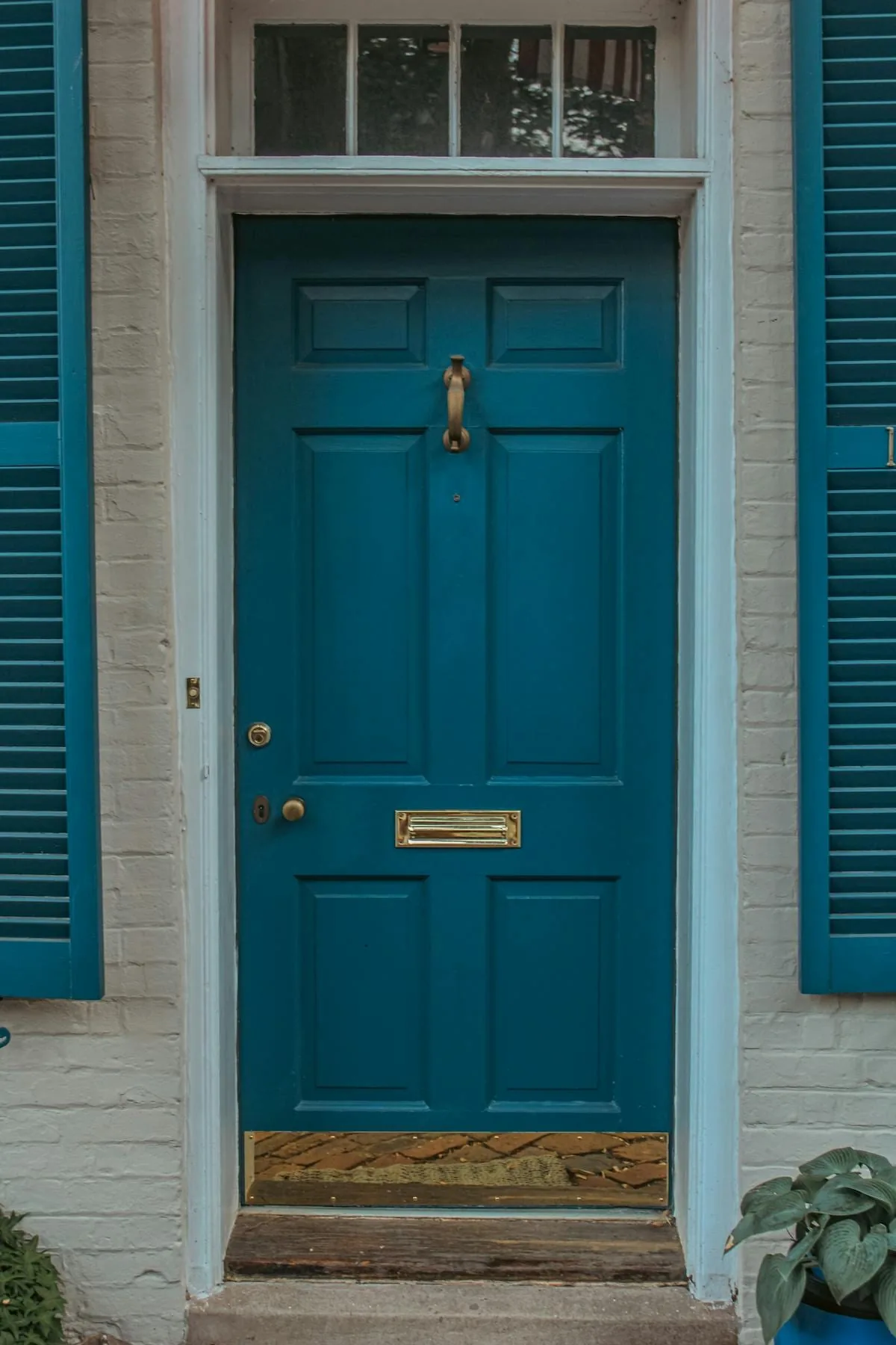
A useful choice on lighter exteriors when you want a little color presence without the entry feeling louder than the house.
If you want to use traditional direction logic, start with the direction the door faces, then translate that into a color family the house can actually carry. Compass rules can guide the palette, but the final shade still has to work with the roof, siding, trim, stone, and planting.
Scroll sideways to compare all columns.
| Door faces | Element idea | Color families to consider | Use carefully |
|---|---|---|---|
| North | Water | Black, charcoal, navy, deep blue | Too much darkness on a shaded entry can feel heavy. |
| East or southeast | Wood | Green, teal, blue-green, natural wood | Very bright greens can look disconnected from brick or stone. |
| South | Fire | Red, terracotta, warm coral, burgundy | Hot reds can feel harsh if the entry already gets strong sun. |
| Southwest or northeast | Earth | Sand, clay, taupe, ochre, warm beige | Flat beige can disappear unless the trim and lighting define the door. |
| West or northwest | Metal | White, soft gray, pewter, warm off-white | Cold gray can look sterile beside warm exterior materials. |
Real facades make the color choice clearer than a paint deck does. Notice how each of the next entries works because the masonry, trim, and planting already support the door color.
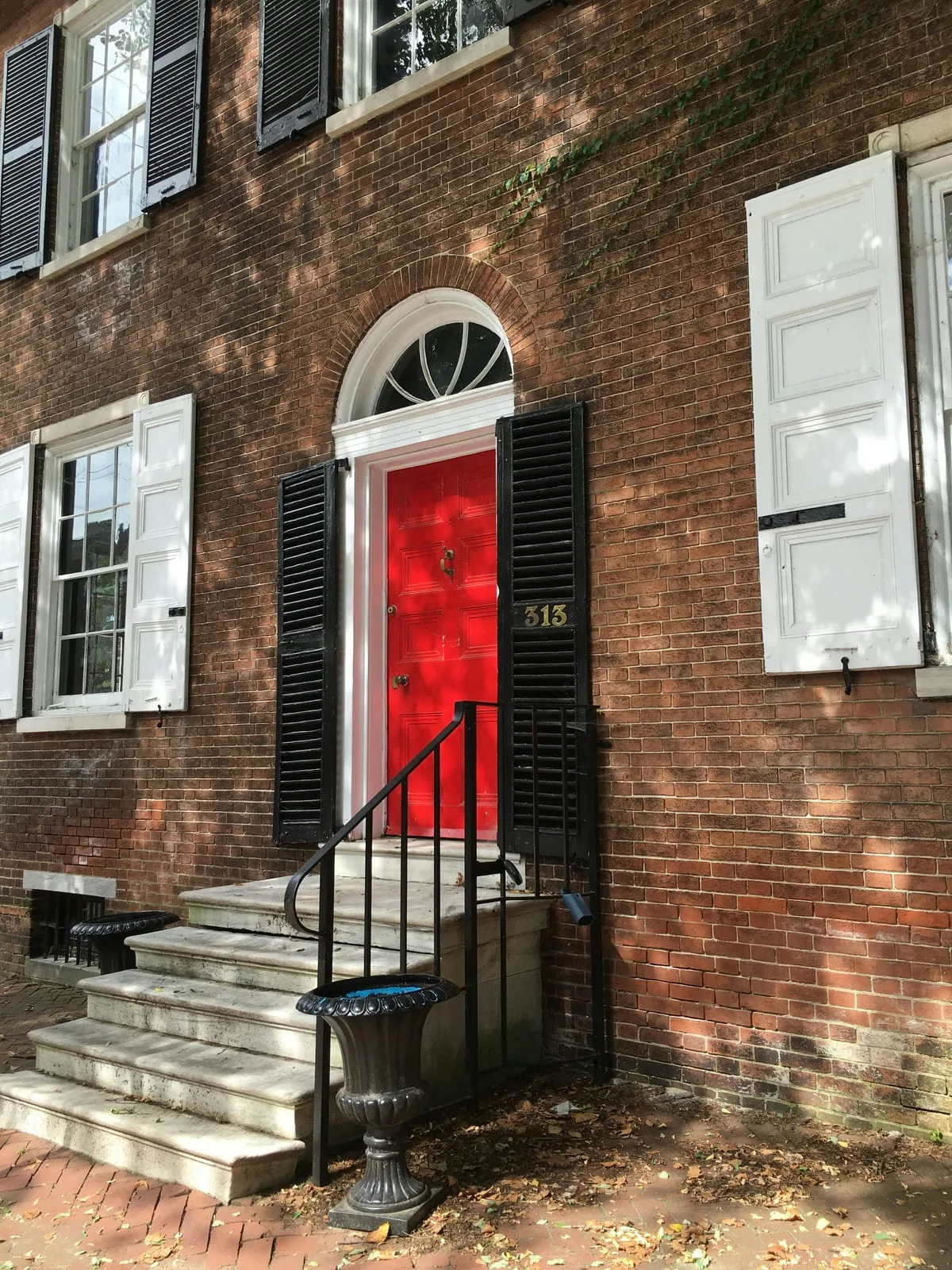
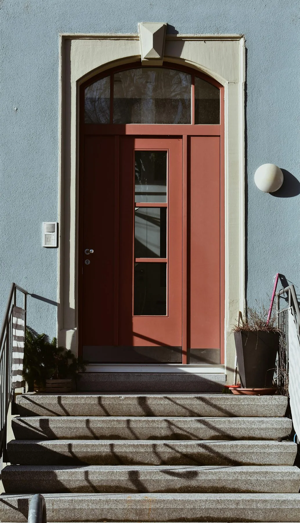
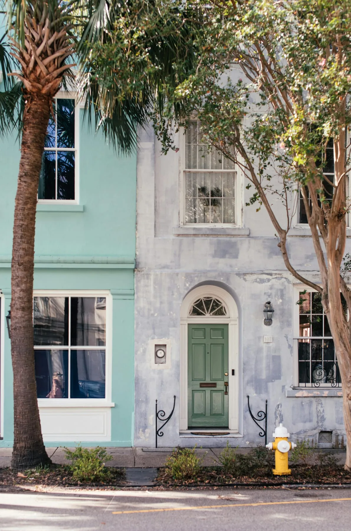
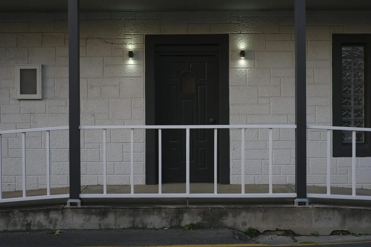
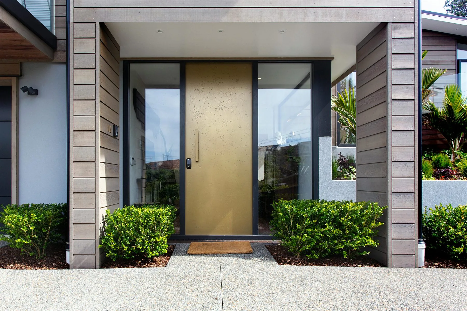
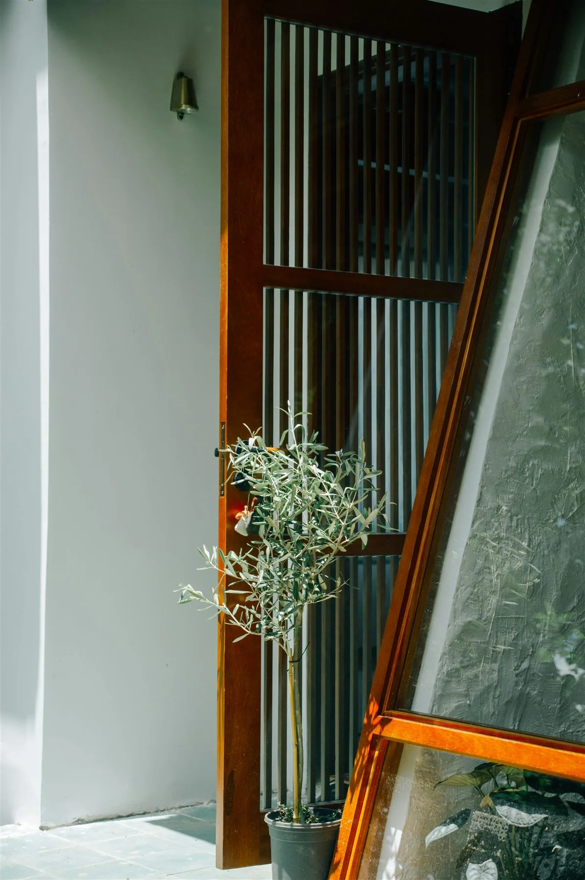
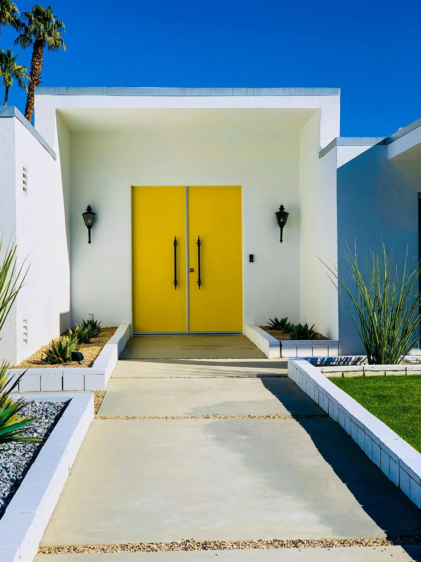
Stronger color is not always wrong, but it does need a house that can carry it. The clearest examples are cleaner modern facades where the door can hold more contrast without making the whole entry feel louder than it needs to be.
Match the Door Color to the Whole Entry
Three front-door color situations that work well
Warm brick or stucco house
Terracotta + Olive + Warm wood
Terracotta, olive, and warm wood tend to feel more at home than colder sharp tones.
Light modern exterior
Muted blue + Charcoal + Warm tan
Muted blue, charcoal, or a cleaner warm tan often give the entry enough definition without making it look pasted on.
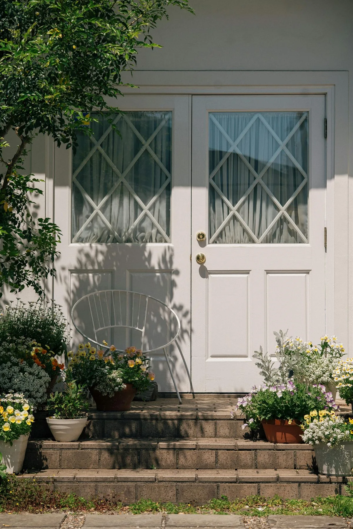
Garden-heavy entry
Olive + Moss + Wood
Green and wood often sit naturally with the planting, especially when the path and threshold stay tidy.
If the wider entry still feels off after the paint choice, feng shui front door is the better follow-up because it goes deeper on path, hardware, lighting, and threshold function. If the issue is the whole foyer palette, feng shui entryway colors is the stronger next read.
Best front door color rule
The best front door color is the one that makes the door easier to see, easier to trust, and more naturally connected to the house around it.
Frequently Asked Questions
What is the best feng shui front door color?
Should the front door be a lucky color?
What weakens a front door color choice?
Does front door color matter more than the entry itself?
The Bottom Line
The best feng shui front door color is not one universal lucky paint. It is the shade that makes the entry look intentional, visible, and right for the house around it.
Choose the color in context, then let the rest of the entry support it with better light, clearer path, and cleaner upkeep.